A (comprehensive) review of the Fitbit Versa
So… disclaimers first. I’m currently an intern at Fitbit. This is both good and bad in that the only reason I can write this review is because I have access to the hardware and have worn it for two months, and bad because there’s probably some kind of subconscious bias sneaking past my best attempts at an honest viewpoint. A manager also read this to make sure I’m not saying anything that I’m not allowed to say, but otherwise did not influence the rest of this piece. Make of that what you will, but I am writing this completely of my own volition, and all opinions in this post are solely my own and do not express the views or opinions of my employer. 😊
Now that we’ve got that out of the way, let’s review this watch!
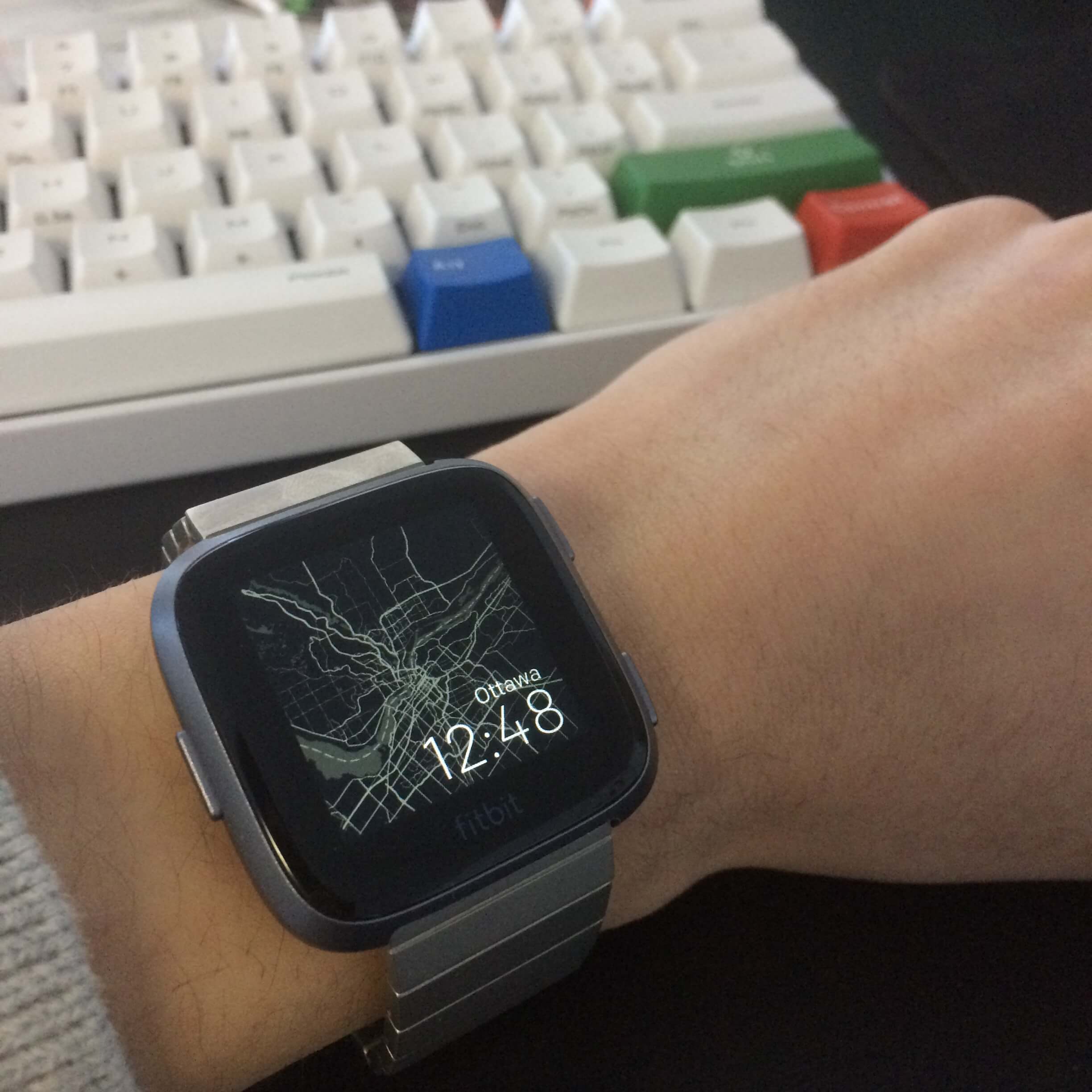
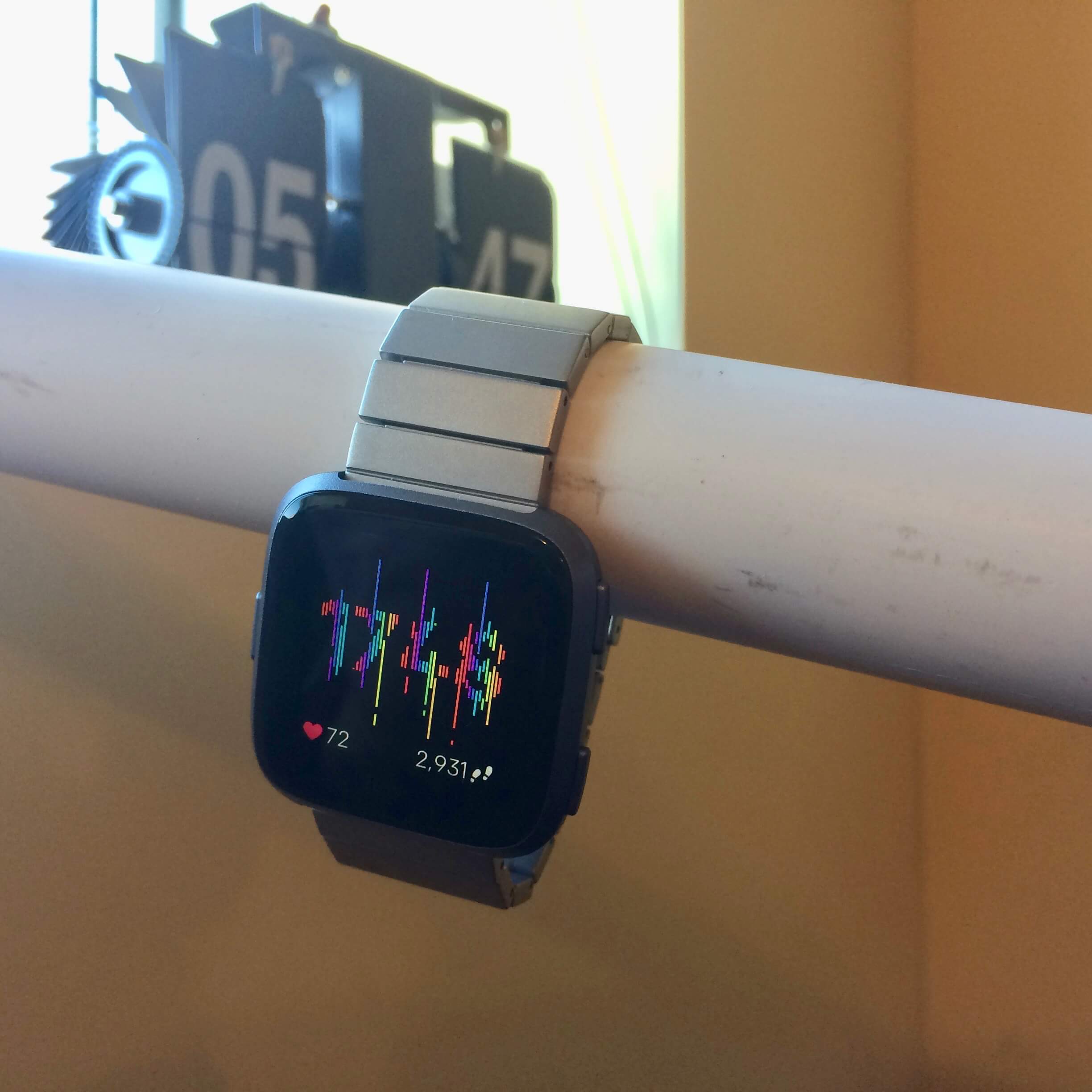
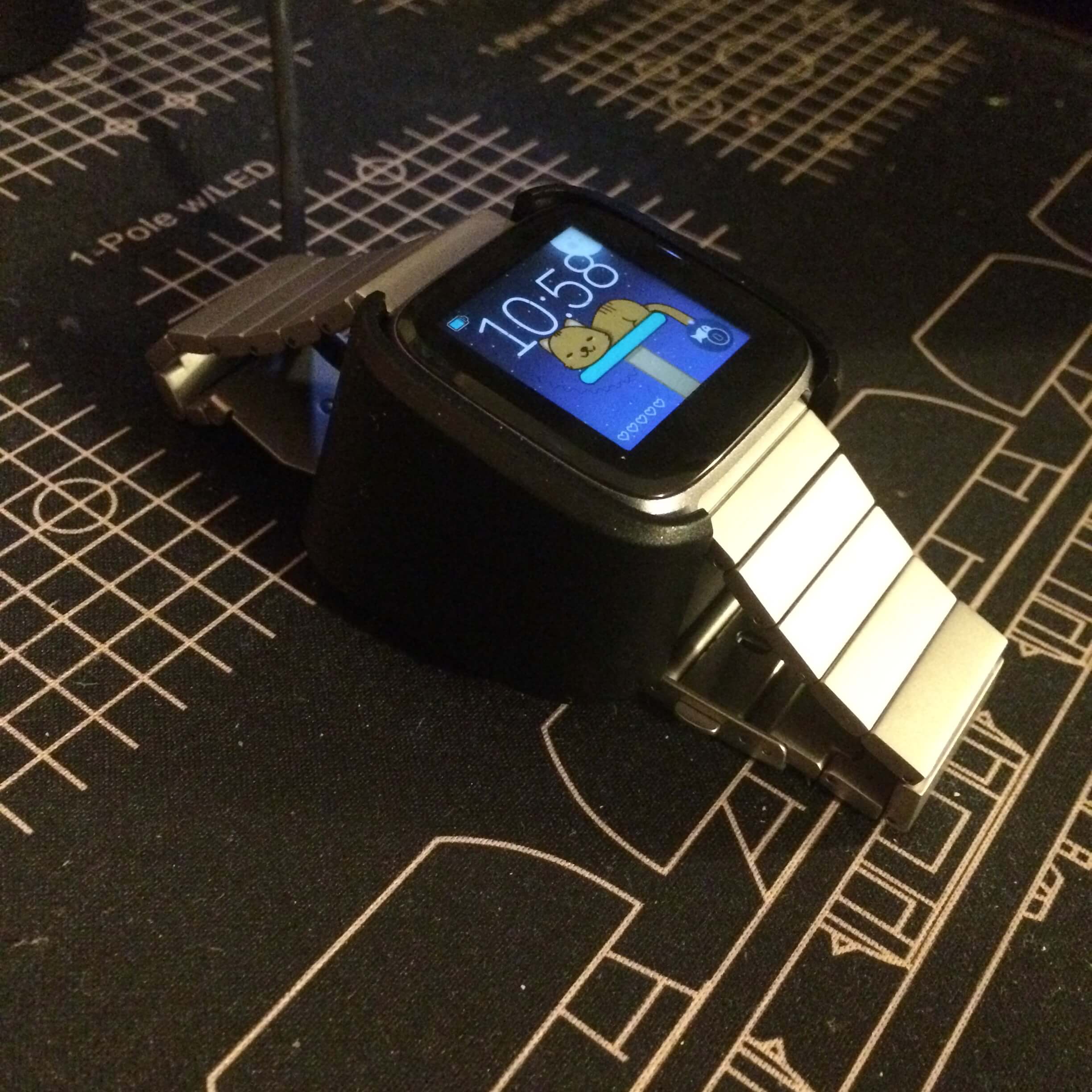
Shameless plug: I made this clock face and you can download it here.
Contents
Who I am and what my use case is
I’ve owned a Pebble since 2016. I bought a Pebble Time with money from my own pocket and then upgraded to a Pebble Time Steel later in early 2017. I liked that watch so much that I’ve written apps and watchfaces for it (first for my high school schedule, then the Breathe app, then the Star Wars Targeting Computer watchface, and finally a Poké Ball watchface), and I don’t think I’ve taken that watch off for more than two or three days at a time.
I used my Pebble for three main things: first and foremost, notifications. The most important aspect of the Pebble to me was its ability to pipe notifications to my wrist, so that I could triage them before pulling out my phone. However, I was and remain an iPhone user, so I could never interact with my notifications on my wrist the way that most Android users were accustomed to. I do have an old Android phone around that I did play with to make sure my Pebble apps worked with both platforms though, making me not a complete stranger to the full functionality that Pebble provided.
Secondly, music control. Other than notifications, being able to control what music was playing from my wrist was very helpful. In the winters of Canada where it sometimes hurts your face outside, it would be physically painful to interact with a touchscreen phone; for that reason, the Pebble was super helpful in skipping around to the next song with gloves on. I used this feature all the time, and I’ve also used Music Boss on Android to control Spotify, Google Play Music, and local music on the device.
Lastly, and perhaps most importantly, being a watch. I loved that I could customize my watch with the thousands of watchfaces. Feeling like Star Wars in the morning? No problem! That calculus test felt like you were being goaded by a sadistic AI? Time for a Portal watchface. Got a more formal evening? Switch to that classy TTMM watchface. The always-on screen, readable in sunlight, and also the low-battery mode that displayed just time were great.
On the fitness tracking side, I never really used my Pebble for that. It would never track my sleep correctly (it invariably showed that I slept <4 hours every night when I was damn sure I went to bed at 10:00 for those nice 8 hours), and step counts were pretty inflated most of the time. The device on my other arm was for that: the Xiaomi Mi Band (original). Stellar battery life at 30+ days, small and discreet.
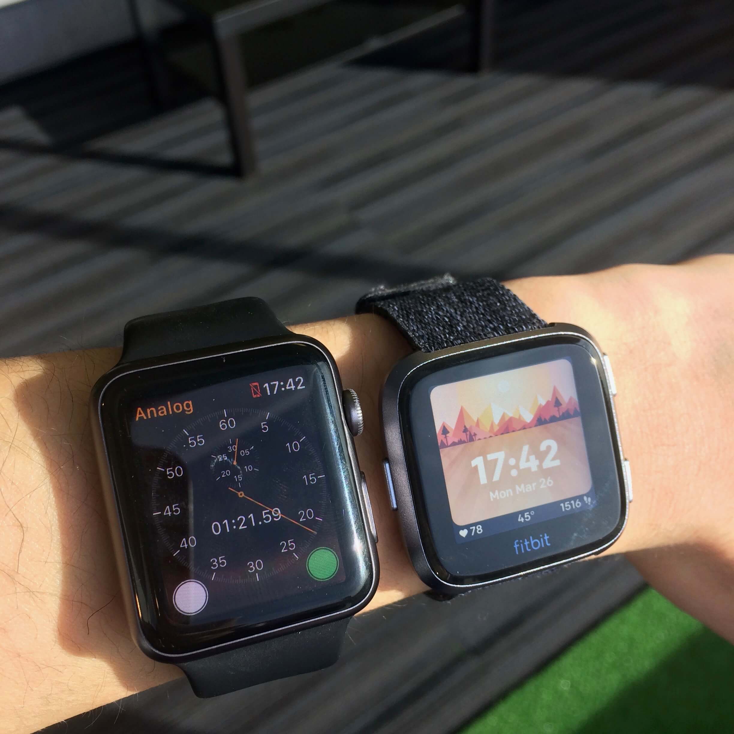
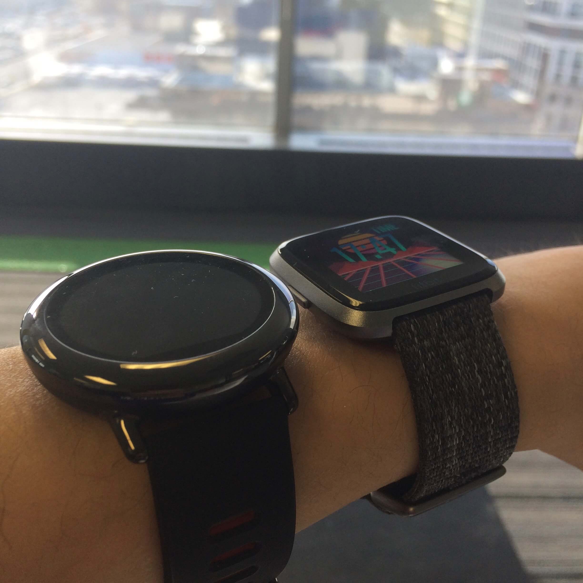
I’ve also borrowed my friends’ Apple Watch Series 0 42mm (thanks Ellen!), Fitbit Blaze (thanks Rohan!), Amazfit Pace (thanks Kash!), my manager’s Pebble Time 2 (thanks Brad!), and I used the Fitbit Ionic for a month. You’ll see this pop up around the review. Given the devices that have inhabited my wrist, I think I can say that I have decent variety in terms of wearables that I’ve used.
Hardware
To put it simply, the Versa has curves and rounds where the Ionic is angular and boxy.
Physical body
I remember the first time I saw the Fitbit Ionic in the Yahoo leak. While I personally didn’t have the immediately visceral reaction that a lot of the Pebble community did on /r/pebble did, I also did not think that it was a graceful looking device.
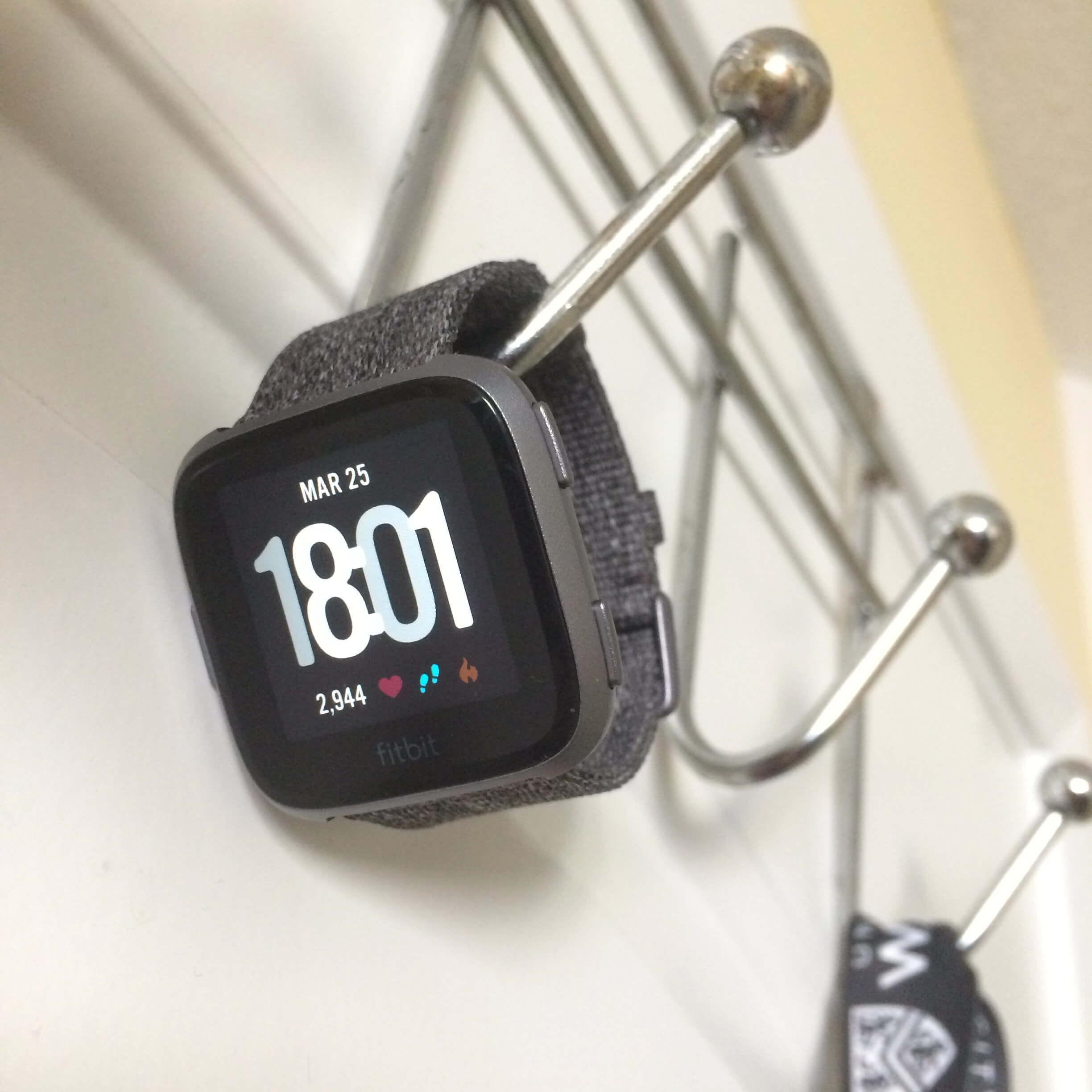
But I really like the Fitbit Versa. It shares aspects of design from both a Pebble Time Steel and the Apple Watch, and that’s a huge improvement over the Ionic. To put it simply, the Versa has curves and rounds where the Ionic is angular and boxy. It has a fit and finish that I felt the Pebble Time Steel lacked, and it feels less… bulbous than the ostentatiously rounded edges of the Apple Watch.
The anodized aluminum body is solid but sits lightly on my skin, and the body itself is small enough that it doesn’t look oversized even on my shrimpy wrist. At 38g for the body itself, it’s lighter than my Pebble Time (42.5g), and the Pebble Time Steel (62.3g), but heavier than the Apple Watch Sport (30g).
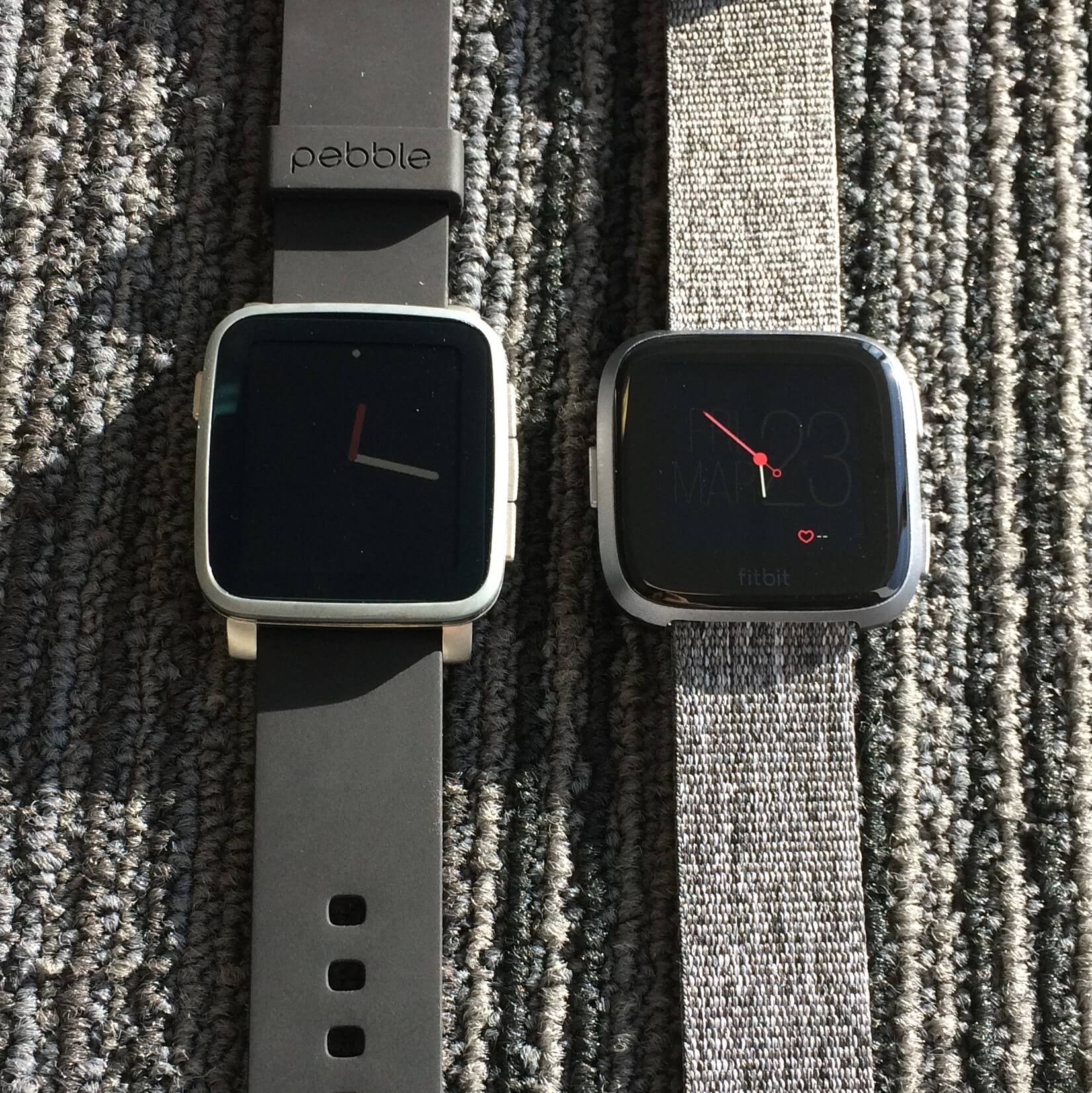
For a size comparison, if you have a Pebble Time Steel with you, turn it over on its side, chop off a bit on the left or right side to make it a square, and you’ve basically got a Versa. It’s also generally comparable to either model of the Apple Watch, although it more closely resembles the smaller 38mm body. In general, the Versa is compact and works great for anybody who has smaller wrists.
The backside houses the heart rate and SpO2 sensors, the latter of which isn’t activated yet. On the front, the Versa has some delightful 2.5D glass on the screen that gently slopes over the edges of the device and meets the sculpted body at an angle; it makes swiping from the edges a much more fluid experience when compared to the Ionic. Overall, two thumbs up from me!
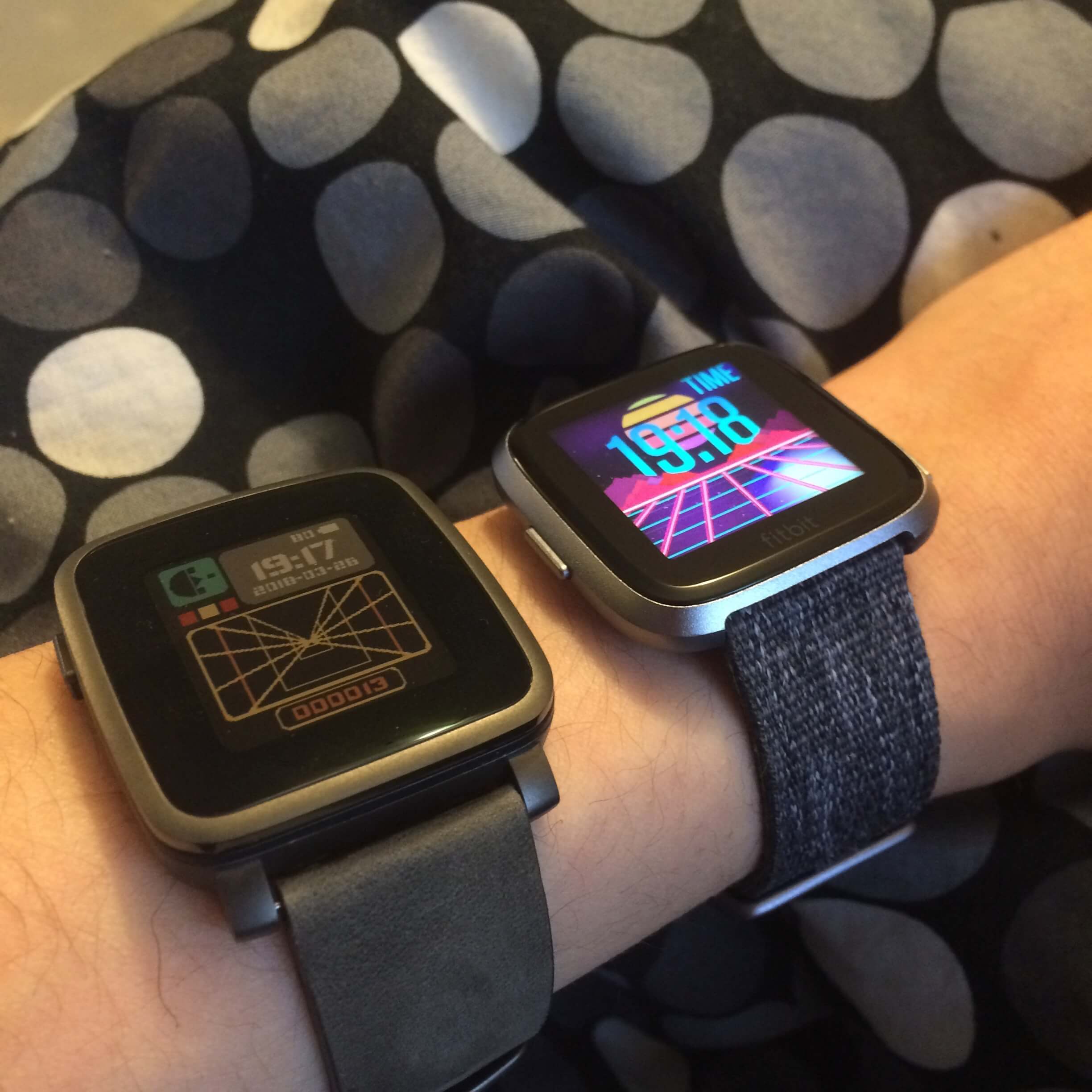
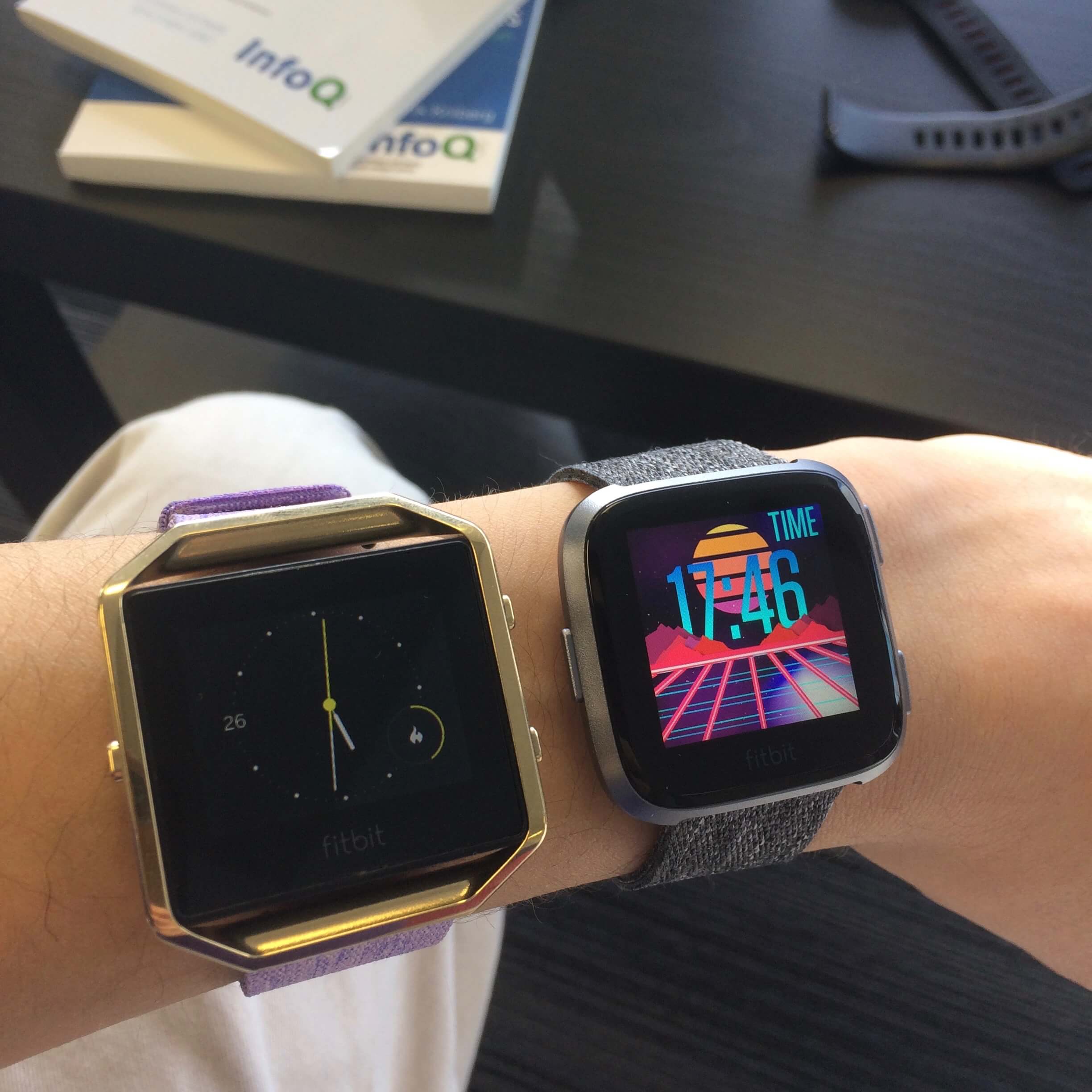
Watches on my wrist. From left to right: Apple Watch (Series 0, 42mm), Amazfit Pace, Fitbit Versa, Fitbit Blaze. The Versa is the slimmest and lightest. Click to expand.
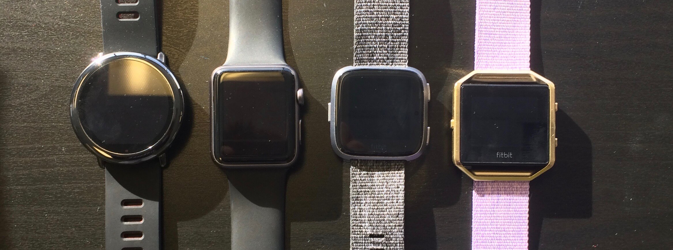 A comparison of several watches. From left to right: Amazfit Pace, Apple Watch (Series 0, 42mm), Fitbit Versa, Fitbit Blaze. The Versa is the smallest one by body size. Click to expand.
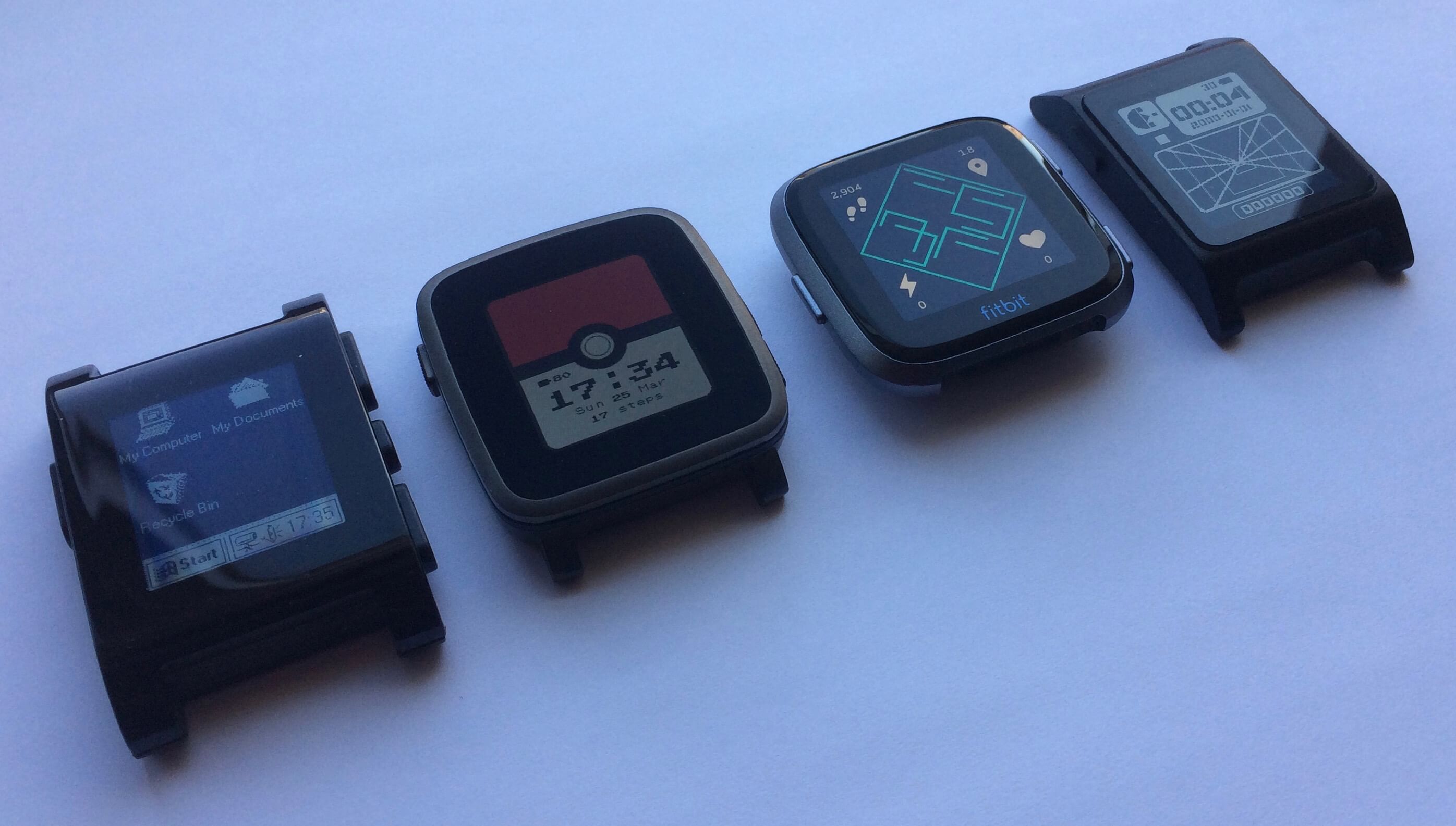 A comparison of the bodies, with no bands. From left to right: Pebble, Pebble Time Steel, Fitbit Versa, Pebble 2. Click to expand.
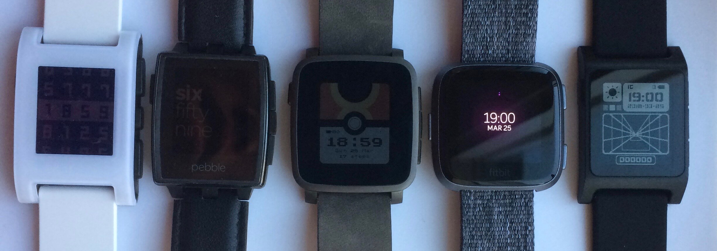 Front size comparison: from left to right, Pebble, Pebble Steel, Pebble Time Steel, Fitbit Versa, Pebble 2. Click to expand.
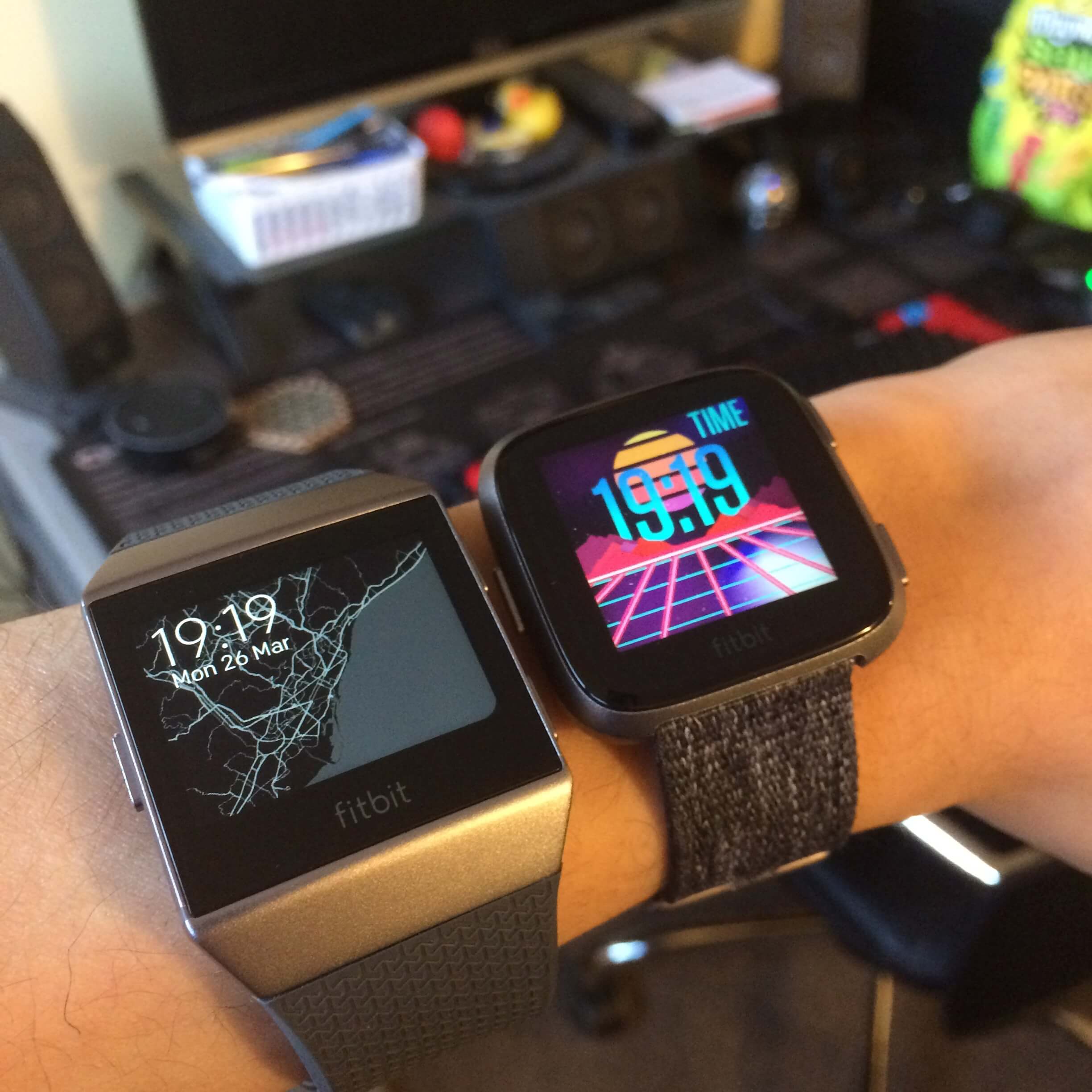
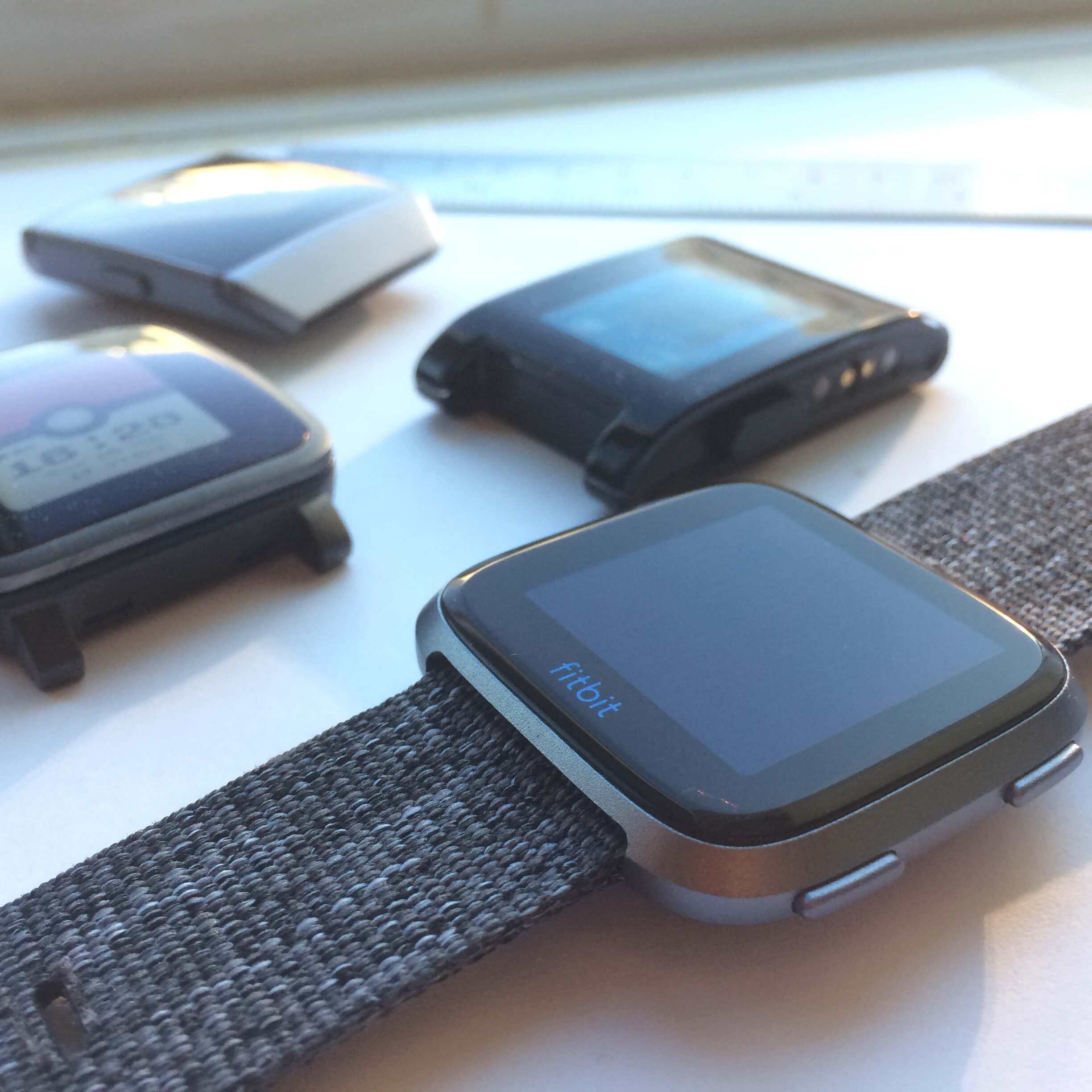
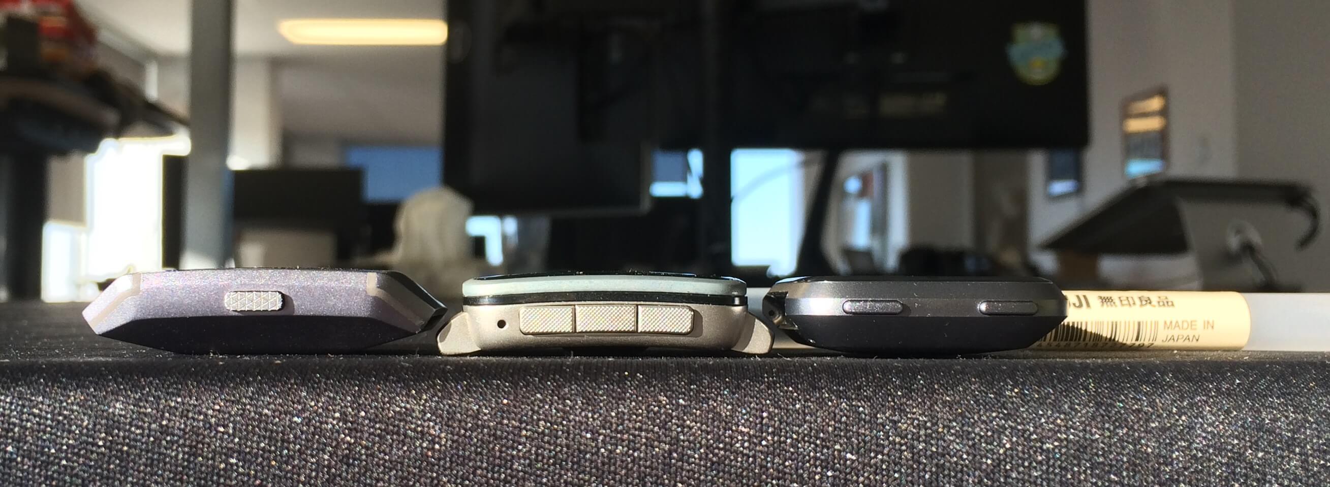 Thickness comparison: from left to right, the Ionic, the Pebble Time 2, and the Versa. Click to expand.
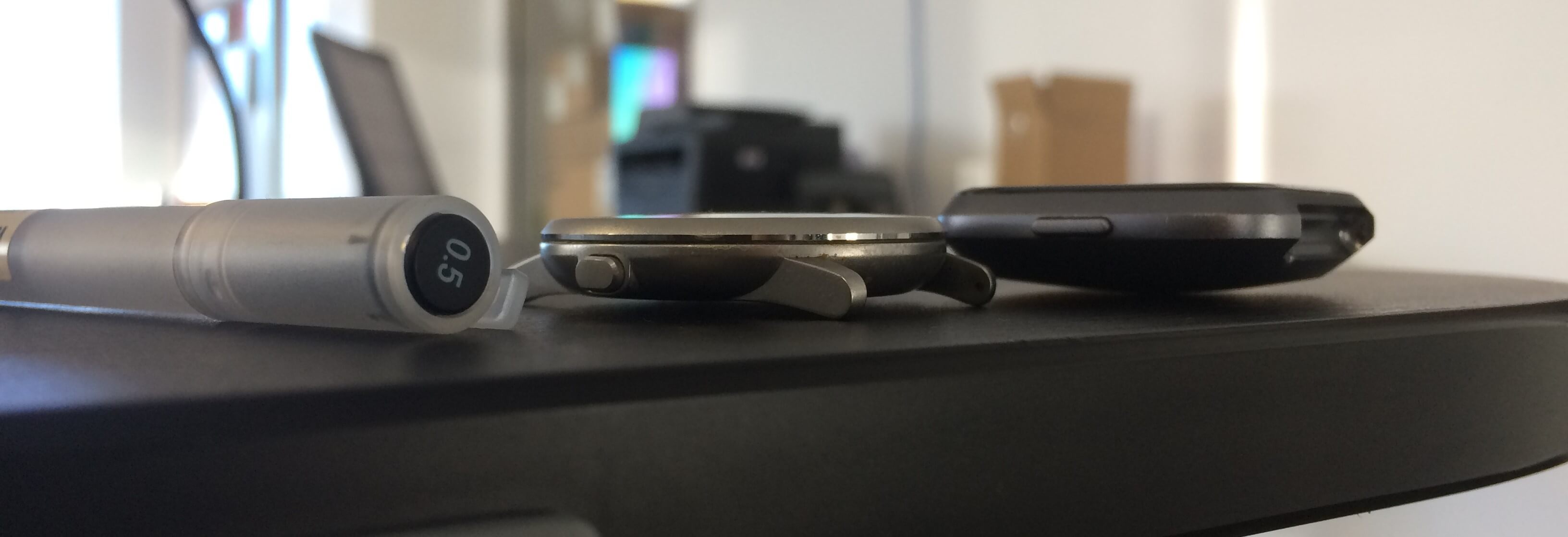 Thickness comparison: from left to right, Muji pen, Pebble Time Round, Fitbit Versa. A Versa is around the height of a pen. Click to expand.
The housing itself is surprisingly sturdy. As a clumsy person, I bump into things a lot, and haven’t managed to damage the device in the month that I’ve worn it. While the Pebble suffered from scratches all over its PVD coating and the Xiaomi Mi Band has marks from hitting steel doors, the Versa is still flawless. I swung it directly into a wall a few days ago–and actually managed to scrape off a chunk of paint and drywall–but the Versa was still sitting contentedly unblemished on my wrist. Kids, don’t try this at home.
An improvement over other Fitbit trackers is that the Fitbit Versa is water-resistant to 50 metres. I’ve showered with it and dunked it in a bowl of water, and everything is still in perfect working order. One of my coworkers has also gone swimming with it, so it seems like the water-proofing checks out! A caveat: droplets of water interfere with how the touchscreen responds. In my case, I could mostly still control my music using the Versa while showering if I stuck my hand out of the waterstream, but having it half-submerged in soapy water during dishwashing made the touchscreen freak out a bit.
Hardware specs
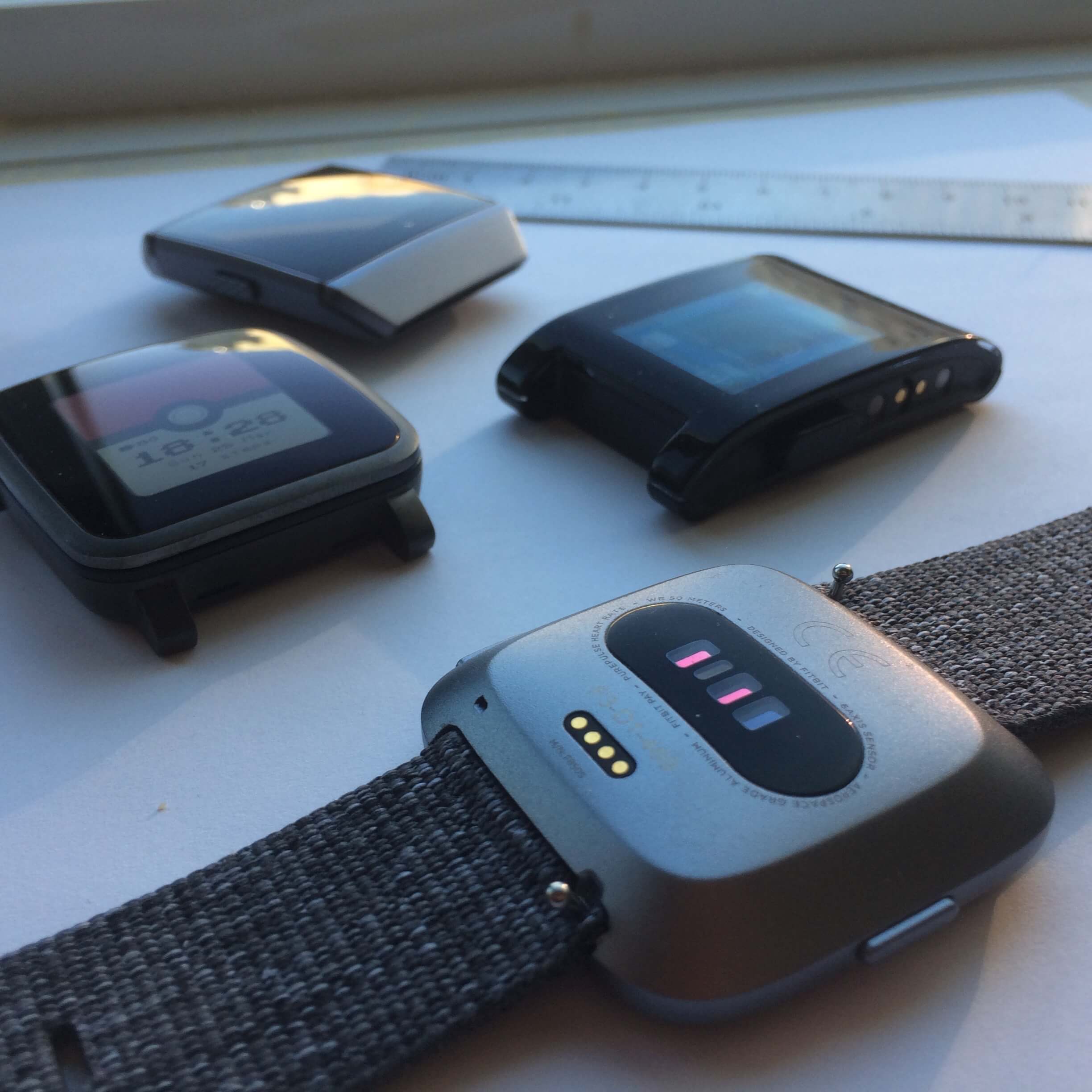 The sensors on the back: heart rate and relative oxygen. When the heart rate sensor is on, it emits green flashes. The charging pins are visible as well.
The Versa is similar to the Ionic, just without the GPS chip. That means there is onboard Wi-Fi, an altimeter, heart rate sensor, relative oxygen content sensor, accelerometer/gyroscope, ambient light sensor, and around 2.5GB of storage for music/apps/watchface. Ionic - GPS = Versa.
If it’s really important for you to have information like mapping your run and super-accurate pacing, then the lack of a GPS chip will hurt. Note that even without a built-in GPS chip, the Versa will still track your exercise: by itself and without your phone, it tracks everything except for location (and pacing is estimated by stride length rather than calculated by distance); with your phone, the Versa will use the phone’s GPS location, which is what Fitbit calls “Connected GPS”.
Another omission stands out: neither the Fitbit Ionic nor the Fitbit Versa have a microphone. This makes it difficult to use the Fitbit Versa for input. I used the Pebble microphone for digital assistance, with the excellent Snowy, and of course, for replying to text messages. With the Apple watch, you can also use a neat feature called “Scribble”, so you can doodle letters with your finger on the touchscreen. Wear OS goes even futher, providing complete support for their Input Method Editor API on their watch, allowing developers to create anything from a tiny keyboard to crazy swipy ones like FlickKey and Minuum. Given all these options on other platforms, Fitbit falls short of providing a great input experience.
Screen
I didn’t think I could go without an always-on screen, but here I am.
Fitbit has opted for a colourful, high-resolution screen for the Versa. At 1.34 inches diagonal and 300x300 resolution, it surpasses the ‘retina’ standard of 300ppi. While not OLED, the blacks are still very much black (seemingly better than the 800:1 contrast ratio on my iPhone 5s), and colours are vibrant and punchy. I personally was pleasantly surprised by the contrast ratio on the device. With the ambient light sensor, it also adjusts based on the lighting; the display puts out a blinding 1000 nits in direct sunlight, making it perfectly readable outdoors, and brightness goes down a lot at night as to not sear your retinas. The screen is readable even at extreme angles, which was one of Pebble’s stumbling blocks with its horrendous off-axis performance owing to both its e-paper and curved glass display.
Screen comparison: Pebble Time 2 on left and Fitbit Versa on right. Bright sunlight conditions.
Unfortunately, the Versa does not have an always-on screen. Waking it up to view the time requires a wrist-lift type of movement. I didn’t think that I could spring for that, but here I am using it as my day-to-day watch. (I can feel people leaving this page right at that sentence.) If having a vivid screen with an always-on display were possible, I’m sure Fitbit would have opted for that, but from my understanding, it’s not an option on the market right now. Consumers generally respond better to having a nice screen even if it comes at the expense of not displaying time all the time.
About seeing the time: waking up the Versa is not as bad as one would think. It is a wrist-flip gesture, about the same as the Apple Watch/Fitbit Blaze and much less finicky than the Mi Band one (I can probably count the number of times that gesture’s worked for me on one hand). I find that the wrist-flip works consistently in basically any situation except for when I want to check the time while I’m lying down, in bed for example. You can also disable the gesture and opt for a button-press to wake the screen up instead, similar to the Amazfit Bip. And while there are a few watchfaces that allow you to keep the screen always-on, I do not recommend turning that option on. It will significantly negatively impact your battery life and draw it own to a day or so.
I do miss the “shake wildly to get the screen to turn on” action of the Pebble, because even if I looked a bit stupid while doing it, the backlight always turned on. But in exchange, I can slap the Versa to get the screen to turn off, so I guess it’s OK. :)
The bezels around the screen are fine. While not as small as the Apple Watch or the Pebble Time 2’s, it’s a massive improvement compared to the Pebble Time Steel and the Fitbit Ionic.
What I don’t like is the Fitbit logo on the front face of the device. The fact that the display isn’t vertically centred bothers me. The logo isn’t super shiny metallic paint, so it’s relatively discreet, but please, Fitbit designers, consider removing that from the front in a future revision.
Fitbit’s VP of design, Jonah Becker, tells us with regards to the logo: “When designing the Versa, we selected elements to optimize for display size, form factor and wearability. The layout we created with the 1:1 aspect ratio with the display as the focal point provided space to include the logo as a finishing touch.”
🤔
Interface
I love the buttons on the Versa. They’re clicky, responsive, and generally a joy to use. They stick out about a millimetre from the main body of the watch, and they’re made of the same aluminium as the main body. I’d say that it’s like a more tactile version of the iPhone sleep buttons, in that they have a more satisfying click sound.
On the right side are ‘up’ and ‘down’ keys that are usually mapped to common actions within an app (for example, the music app has them mapped to volume + and volume - respectively); the left side has a ‘back’ button most commonly used for navigation. The pills are far enough away from each other that even with gloves on, I can hit them with good accuracy.
Those are some very nice buttons!
What I like less is the touchscreen. Mostly the fact that it exists. Like The Verge said, Pebble is dead, and hardware buttons are going with it. The Versa’s controls are divided between hardware buttons and the touchscreen, with the touchscreen being the primary control. Getting to the app drawer means a swipe to the right. Starting an exercise means selecting an exercise type with the touchscreen. The list goes on. The screen gets smudgy sometimes with these interactions, but it’s easy to wipe off. In conclusion: the touchscreen is there and it works well, but I miss how I could interact with my notifications with gloves on and with my eyes closed with my Pebble.
Speaking of notifications: the vibration motor on the Versa is middling. While the Pebble’s motor would be the equivalent of somebody giving me a nudge on my wrist, the Versa’s motor feels more like a caress. It doesn’t feel as precise as the Apple Watch (with the tap-tap Taptic Engine), but has about the same strength. There are also fewer vibration options (the only options are strong and normal, both of which make a two-vibrate pattern) compared to a Pebble. On the other hand, haptics are more integrated into the experience than the other two devices: there’s a bit of haptic feedback when opening apps and flicking through tumblers in timers that I really personally like.
Battery
…it holds its own at a respectable ~4.5 days of battery.
To give an indication of how I use the device: I usually get around 40-50 notifications piped to the watch per day, I have Bluetooth enabled essentially all the time, HRM set to ‘automatic’, and use a few apps like Timers and the like every day. Once in a while, I’ll use it to track a walk around a few kilometres in a week with connected GPS turned on.
With this use case, battery life on this thing is very good. It holds its own at a respectable ~4.5 days of battery (Fitbit advertises 4). Charging time is good enough that I can usually give it a top off in the morning before I leave the apartment and it’ll stay charged for the rest of the day. Its longevity is much better than the Apple Watch, but it doesn’t quite reach the heights of the Pebble Time Steel’s supposedly 10-day battery life (although I only ever got to around 6 at best with the Time Steel) or the Amazfit Bip’s 30-day battery.
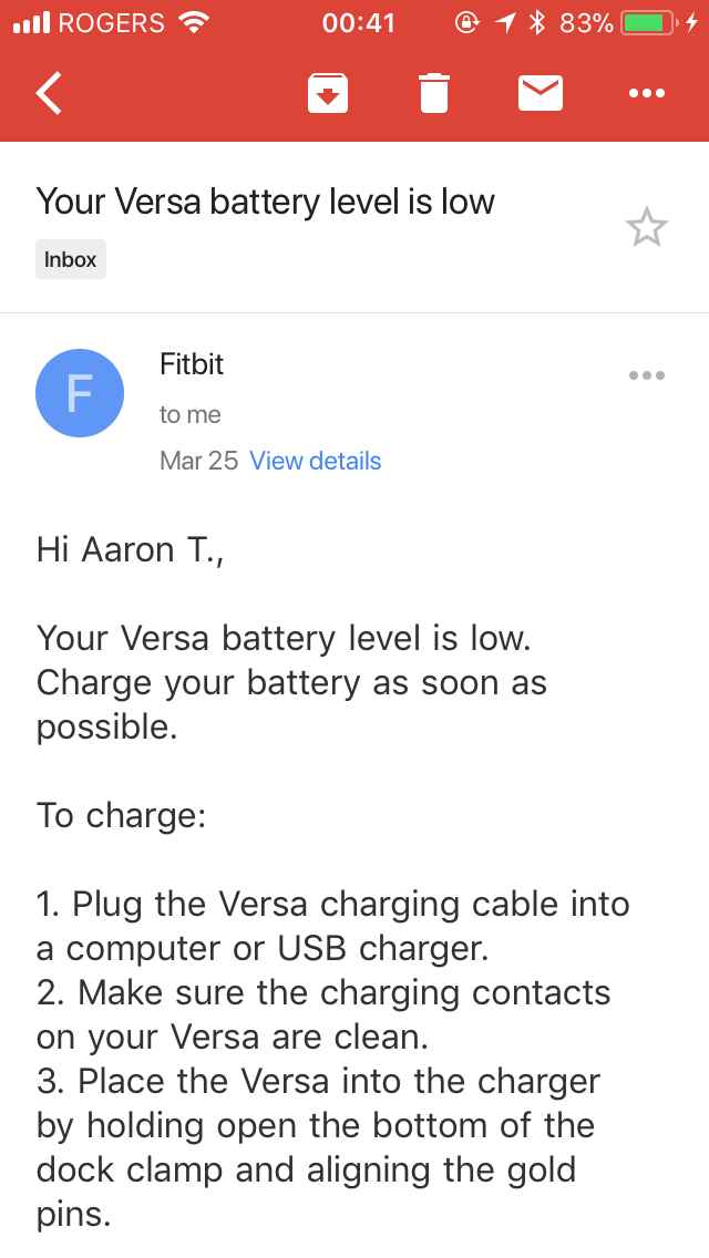
A nice touch from Fitbit are the low battery messages that Fitbit sends you when the battery needs a charge. It’s a small gesture, but considering how rarely I need to charge, getting a notification via the app (on all the devices I have a Fitbit app installed) and an email prompting me to put it on the charging cradle is great for keeping my device alive.
What about the charging cradle? I don’t like it.
Charging it is a throwback to earlier Fitbit devices where you had to clamp down on them, but it’s not nearly as bad as the Blaze where you had to remove it from the frame every time. It’s somewhat easy to accidentally put the Versa in backwards when charging: the cradle is a symmetrical squircle with no obvious markings of up and down. Once you start charging, you can’t access any of the buttons, which is inconvenient–a few of my coworkers drilled holes in the side! And if you’re using a watchband that’s one continuous loop (like a link band, for example), the wire that comes out from the back of the cradle makes it difficult to even put the watch on the charger. Good thing you don’t need to charge the Versa all too often.
For charging time, it takes me about an hour and a bit on an iPhone charger to get a full charge.
Customization
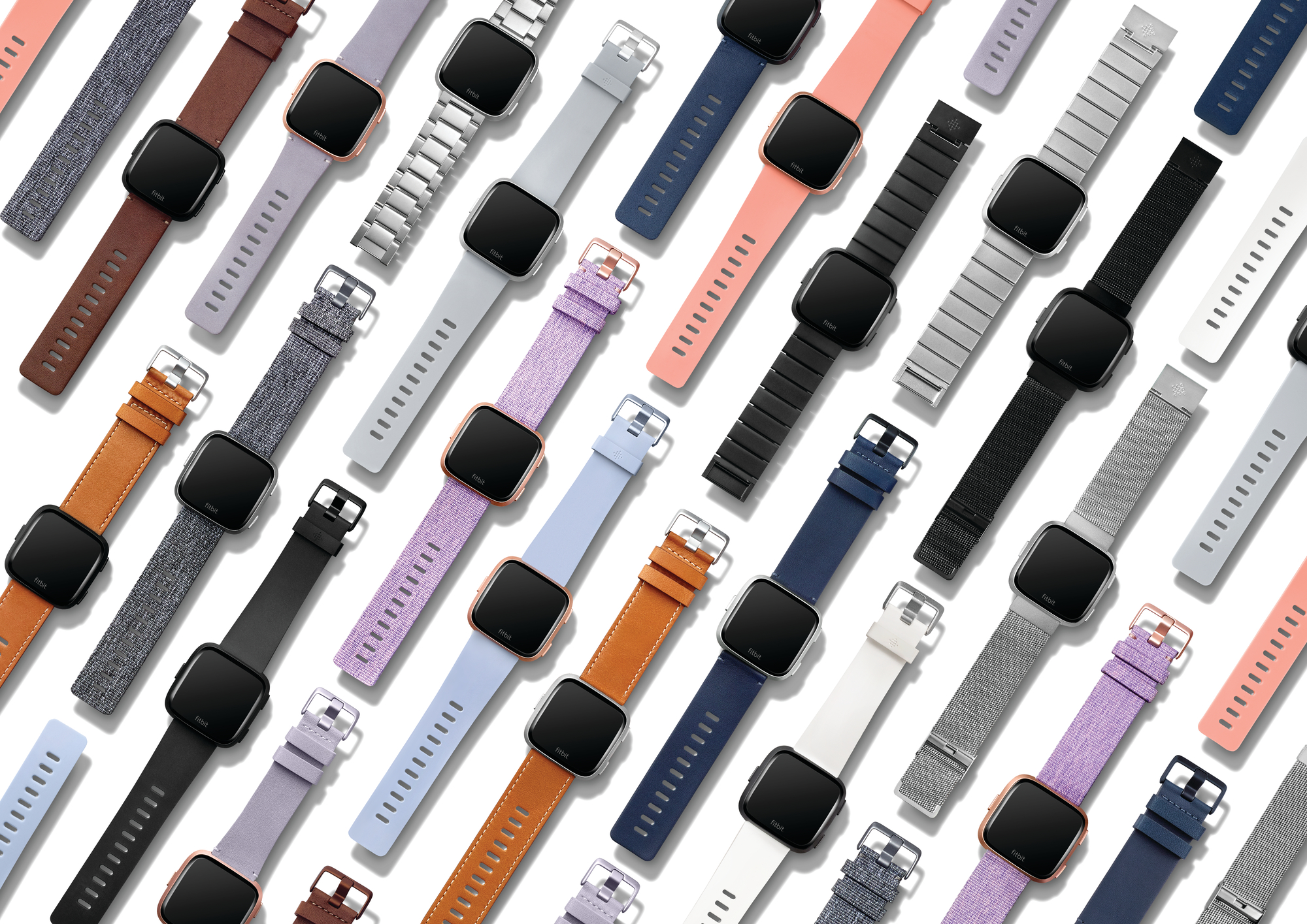 Look at all these bands and colours! From Fitbit’s press kit.
I like the colour options that Fitbit gives; I personally wear the graphite case on most days, but I sometimes take the rose gold off the desk. The black Versa has a very cool stealthy look to it too (especially if you get a black metal band from a third party to pair with it), but they didn’t have any left for me. :(
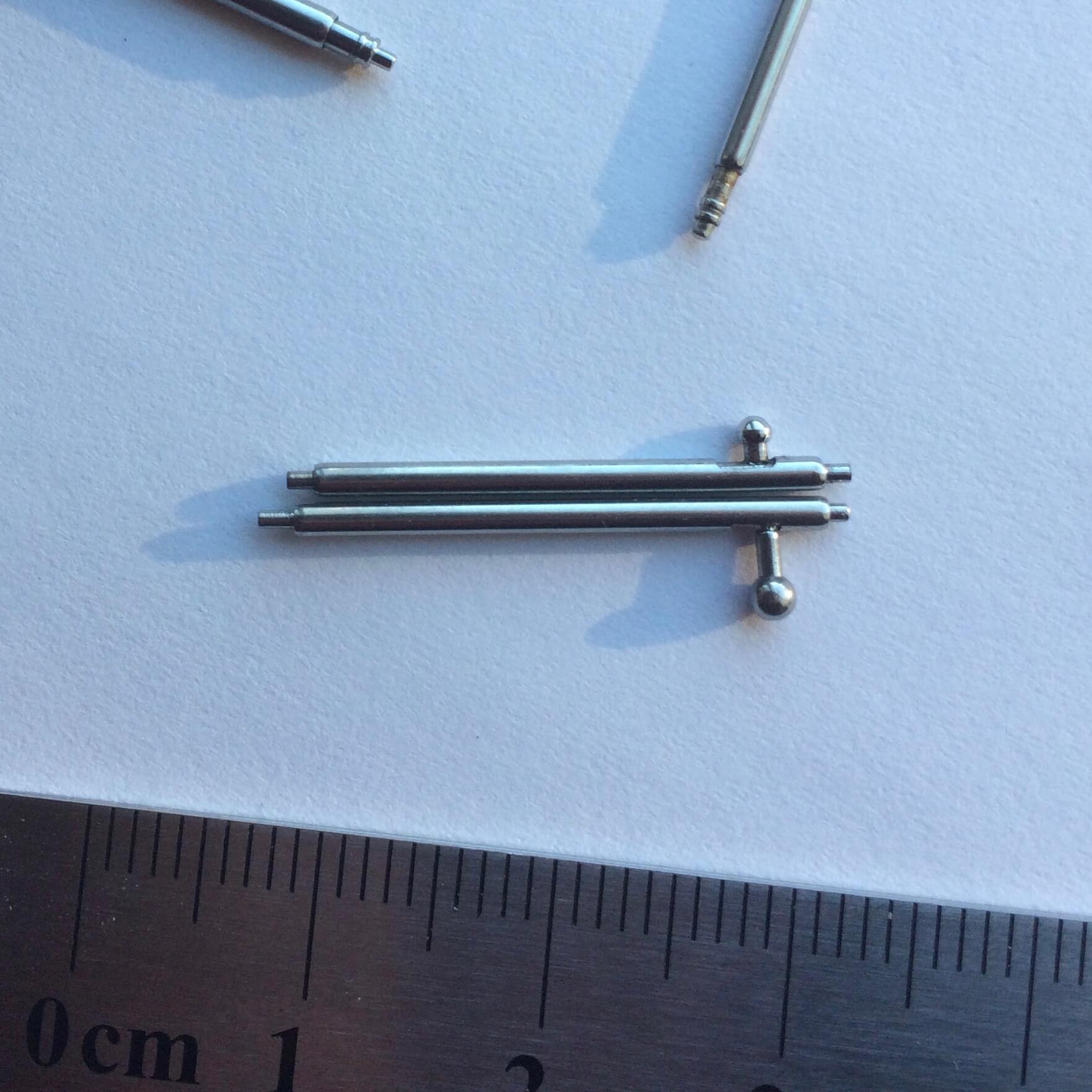
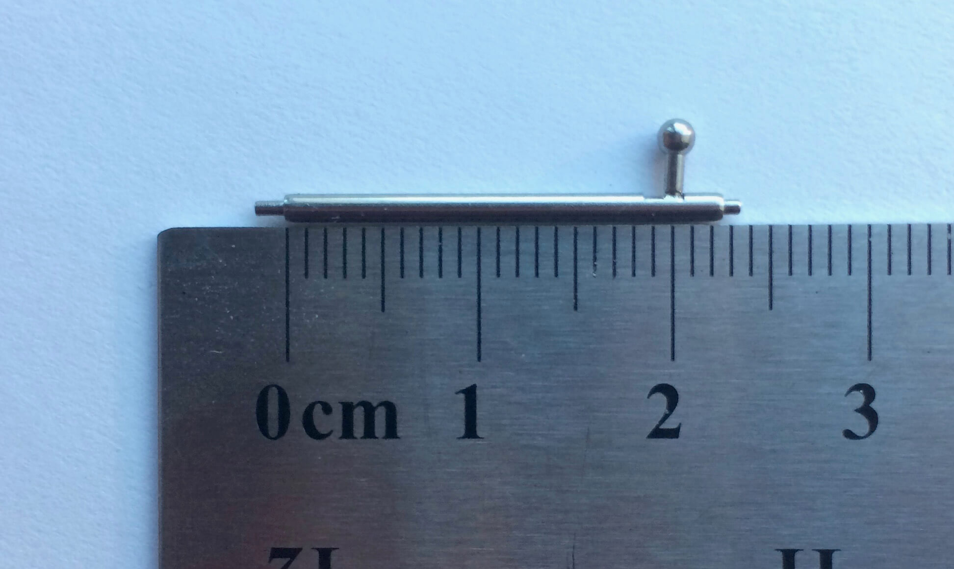
On the top, a standard 22mm quick release pin. On the bottom, the Fitbit Versa’s pin.
As for bands, well, I’ve got some good news and some bad news. Good news: the bands are 22mm—bad news: except when they’re not. Fitbit has made the bands on this device based off of 22mm bands, but not quite completely compatible with them. Basically, they’re like 22.5mm wide, so most watchbands made for 22mm won’t work unless you’ve got pins that extend just a little bit further. Most quick-release bands will not work for this reason: they’re made for 22mm, no more, no less. In addition, because the pins are recessed in the device and aren’t external lugs, the watch band needs to be pretty narrow around the pins for it to fit in the body of the Versa.
I was lucky enough to find two pins out of my collection that fit, and have used a metallic band from my Pebble days on the Versa. What didn’t work included the default rubber band on the Pebble, the genuine leather bands, or any of my NATO straps. On the plus side, the pins on Fitbit’s TPU bands are removable, so you can repurpose those and use them with other 22mm bands if their pins have cutouts for quick-release and can be exchanged.
A closer look at the Fitbit Versa's pin.
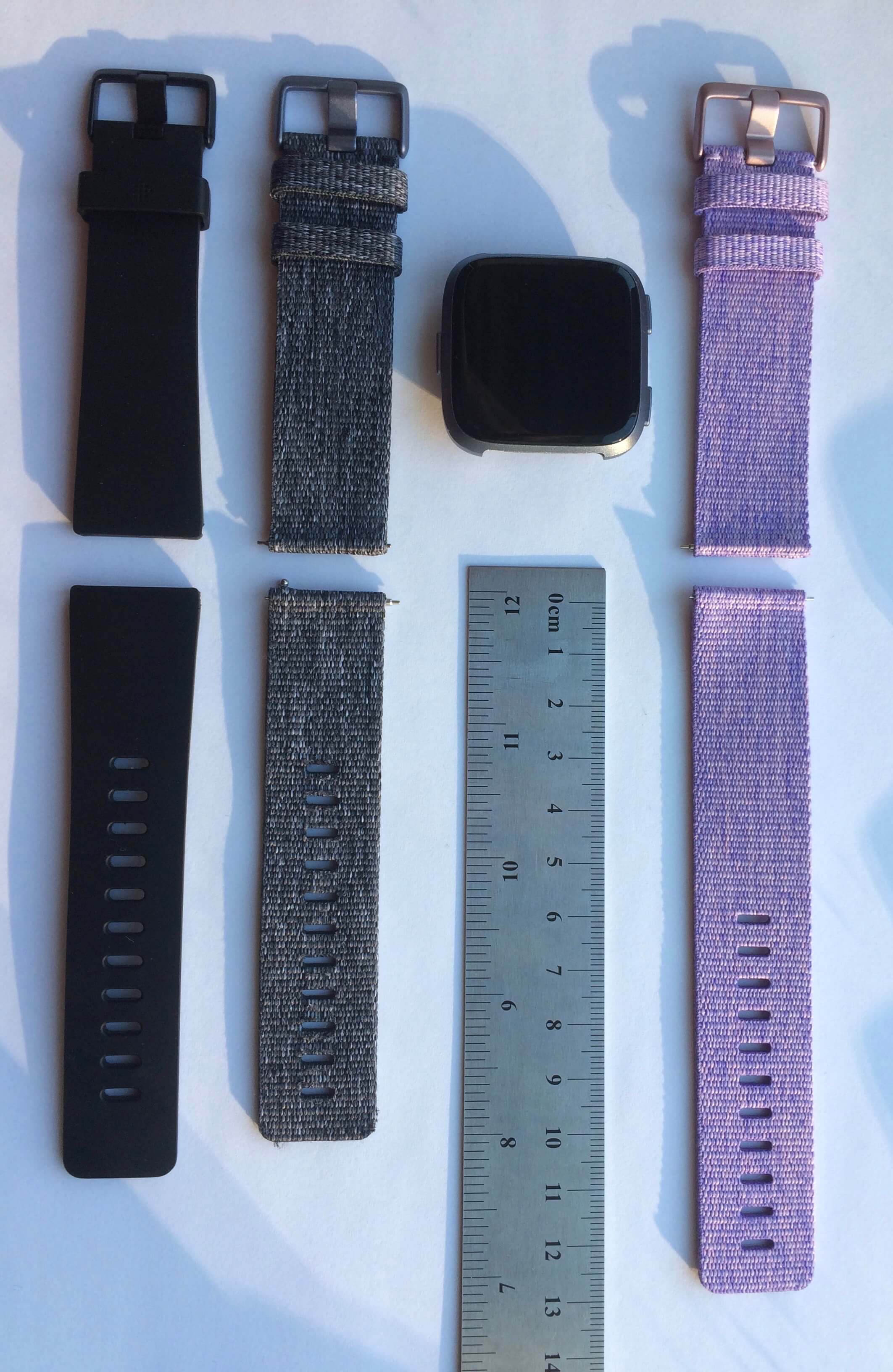 Some of the Fitbit Versa’s bands. From left to right, black TPU band (small), charcoal woven (small), and lavender woven (large).
Because the device is made by Fitbit, you’ll be sure to find some bands that work on their website, as well as unofficial ones on Amazon and probably Taobao/Aliexpress. A nice thing about being a popular company is that people make accessories for your devices! On the first-party bands: I like them. If you have the extra money, go for the woven ones (you can only get them if you buy the Special Edition of the Versa). Personally, I find that they look very refined, and they dry out faster after getting wet as well. There’s a decent selection with lavender and charcoal woven bands, along with peach, black, and grey TPU bands, all of which pair nicely with the body colours. Plus, those metal link bands they have, while expensive, look 🔥.
If you previously bought a Fitbit Blaze, most of the bands do seem to be (unofficially) compatible. You might have a bit of difficulty getting them on to the device because the pins are more recessed on the Versa, but with a good prodding, they should fit in.
In conclusion: The band situation on the Versa is interesting. While it is more compatible with standard watch straps, it’s limited by the design of the watch and the absence of lugs. It loses the easy-to-remove and easy-to-attach band of the Ionic which I quite liked, and it’s also not as user-friendly as the slide-in straps on the Apple Watch. And because the pins are recessed in the device, it’s harder to switch straps out compared to something like a Pebble where the lugs stick out. You win some, you lose some.
Special Edition or not
Differentiators: SE has NFC for payments. SE has woven bands in addition to the TPU ones. SE costs $30 more. Otherwise, they’re identical. I would go for the special edition if I had the extra $30.
Software
Let’s move on to the software. I’ve ordered this section in terms of importance to my uses, so if you want to skip to particular sections, just keep on scrolling down.
Fitbit OS
In general, the touchscreen is used for navigation around the OS, with the back button playing the role of, well, the back button.
Navigation in the operating system is very similar to basically most smartwatches: the most important elements in the UI are the watchface and the app drawer. By default, when you lift your wrist, you land on the watchface. Swipe down from the top, and you get to a list of your notifications (up to a maximum of 30). Swipe up from the bottom, and you launch Fitbit Today, which is a convenient dashboard for a whole bunch of of health content. Swipe to the left from the right edge of the screen, and you get into the app drawer.
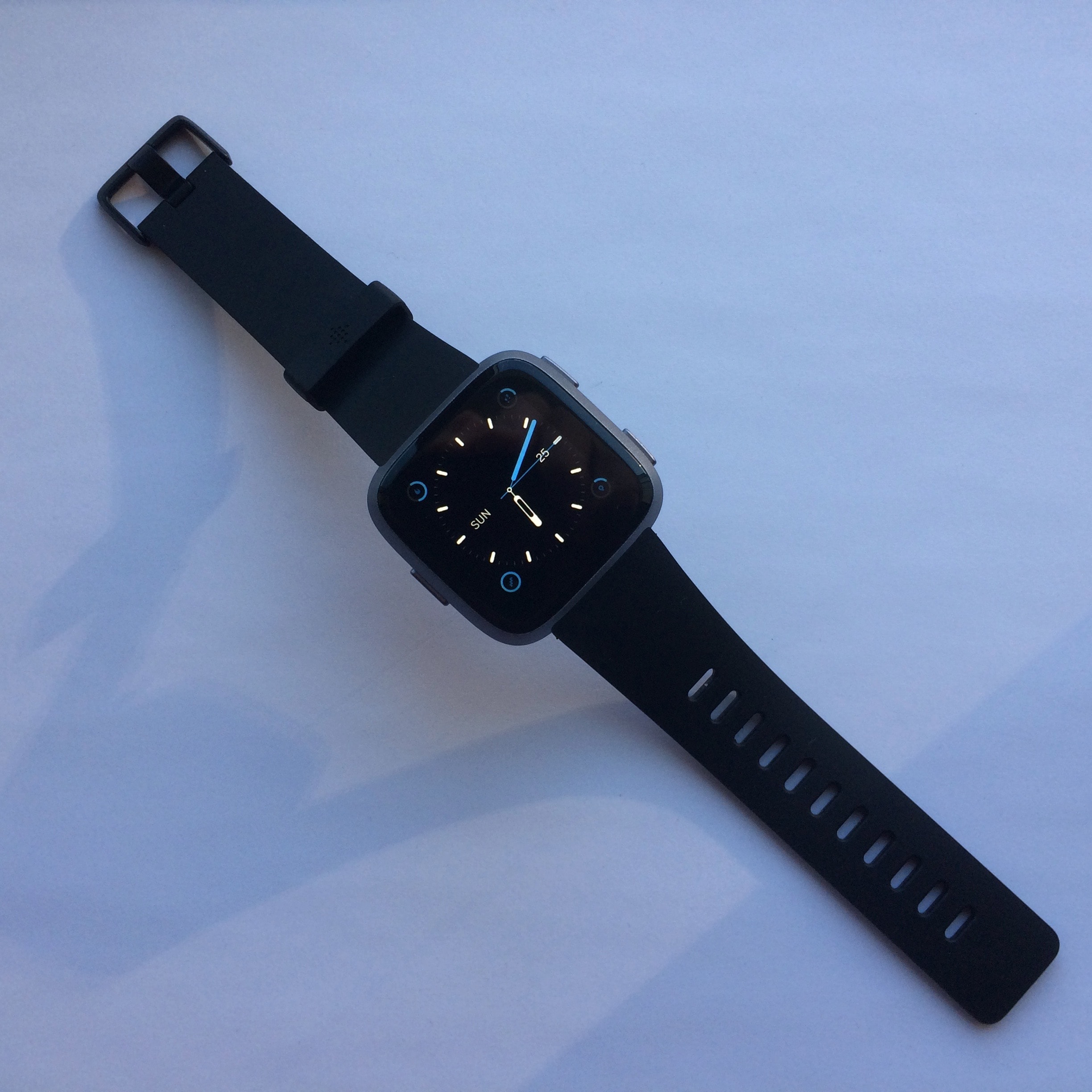
A quick tour of the interface. Sorry about the lighting!
The Fitbit is also nice in that it gives you some convenient button shortcuts:
- Long pressing the back button from any screen launches a popup that allows you to do any of three things: music control, quick settings, and payments. When you have music playing either on your phone or from your watch, the view switches by default to the music control app. From this screen, you can play/pause, skip to next or previous tracks, view title/artist and progress, and most importantly, control volume. The up and down buttons are mapped to the up/down volume. When nothing else is happening, you access quick settings: you can control whether the wrist flip gesture is enabled, or enable/disable notifications. Lastly, you can do payments from this screen, but since only RBC works in Canada, I haven’t been able to test this feature and Fitbit thankfully gives you the option to hide this section if you don’t need it.
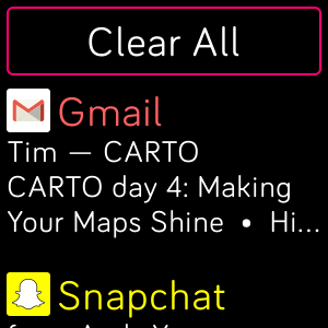
- Long pressing the up button lets you view your notifications from anywhere in the OS. You can scroll through them and interact with them as if you were on the watchface. When this view is open, you can click the up button or the down button to quickly scroll all the way to the top or the bottom. This is really useful for getting to the “clear all notifications” button, which is at the very top of this view.
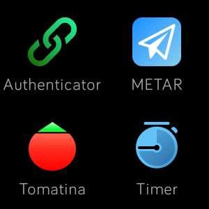
- From the watchface, clicking the up/down buttons are basically ‘quick launch’ apps. The apps you have in your drawer that are on the left side of the first screen are mapped to these buttons. For example, I have Authenticator and Tomatina on the first page of my apps, which means that when I click ‘up’, Authenticator is launched, and when I click ‘down’, Tomatina is launched. Disclaimer: the Authenticator app is not publicly available.
In general, the touchscreen is used for navigation around the OS, with the back button playing the role of, well, a back button. The up and down buttons will not move items up and down, and are used more for confirmation/cancellation, and there is no select button like the Pebble. In general, I find the Fitbit/Pebble up/down/back navigation scheme much more intuitive than an Apple Watch, where the crown does triple-duty exiting to the homescreen, scrolling, and exiting back to the watchface, and definitely better than something like an Amazfit Pace where it’s almost all touchscreen.
The OS… it’s slow. Using a Pebble, I was used to a consistent 30 fps experience and apps launching essentially immediately. With the Apple watch, scrolling through menus is still smooth, even if apps aren’t the fastest. The Versa feels like it’s a little bit behind all the time; it’s not as responsive as I’d have hoped. In smoothness and fluidity, there are some major things that need to be ironed out—the interface seems to be going at about 15fps when scrolling around, and that is nowhere near the consistent framerate of the Pebble nor even the choppy performance of the first-generation Apple Watch. On the good side though: it’s much improved compared to the Ionic was at launch, and every update so far has made the watch more responsive. The engineers at Fitbit want a fast watch too, and they’re working very hard!
Another good thing about the firmware: I haven’t had the watch freeze hard on me, nor have I had it reboot spontaneously. Both of these problems have plagued me on the Pebble Time, where the watch would reset itself to factory setings every few months, and crash if I was running an app and a notification came in.
As for the design—the software feels modern, it’s approachable and looks really good, but at the same time, it’s missing some of the whimsy. Animations on the Pebble helped humanize the hardware-restricted OS. Over on the Apple Watch, the little animated stick figures doing activities is endearing. Fitbit would do well by adding a few more small animations around the software. If you’re interested in reading more about the design, there’s a very informative blog post by Lawson Kight, the lead designer, you can check out. There’s also a cool gallery of the font that Fitbit uses on the Ionic and the Versa.
Nota bene: everything I wrote about above is changing at a pretty rapid pace. Fitbit is updating the watch with major new features/redesigns every six months or so, and I know that they’re going through the list of must-haves for the watch. They generally do deliver on promises: Fitbit OS 1.1 brought third party apps, and Fitbit OS 2.0 (the one that’s shipping on this watch) brings a redesigned popup drawer for music/quick settings as well as Fitbit Today. [Update: And Fitbit OS 2.1 has brought notification actions for Android users.) However, watch updates are not a good experience. Updating downloads the firmware using the Wi-Fi chip on the watch itself, and sometimes the network isn’t strong enough for it to finish successfully. It takes sometimes upwards of an hour for me to successfully update a watch, because of connectivity issues, failed attempts, and general sadness. I recommend putting it in its cradle, and just leaving it alone. Loud noises scare updates away.
Notifications
Notifications are limited right now, but Fitbit is going to update the experience.
In the notification shade: scrolling through a list, then tapping on a notification for more details.
Time for the big and meaty part. Notifications.
The first time I got my Fitbit, I thought that notifications were broken. It turns out that Fitbit has notifications set on a whitelist basis, rather than letting them all through by default. In the mobile app, you need to click on your device, scroll down to notifications, and manually toggle notifications for each app that you want to enable. These toggles only show up after the app has sent a notification as well if you’re on an iPhone, which means that you’ll have to miss at least the first notification after you set up your watch. On Android, you can enable all notifications with a toggle.
There’s a pretty stark difference in the way that Fitbit and Apple handle notifications, versus the Pebble. In the Pebble app, notifications are one of the main tabs in the tab bar, reflecting its importance and how the Pebble revolved around delivering notifications to the wrist. With the Apple Watch, it’s a submenu under one of the tabs. In the Fitbit app, it’s a submenu underneath a submenu of the device view that you enter by clicking the top left of the screen under the dashboard.
…yeah. A lot of people actually like this whitelist sytem, but I’m not that big of a fan.
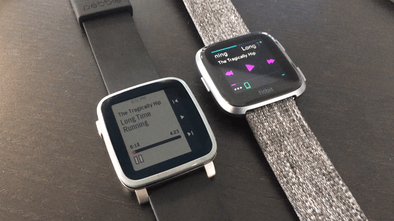
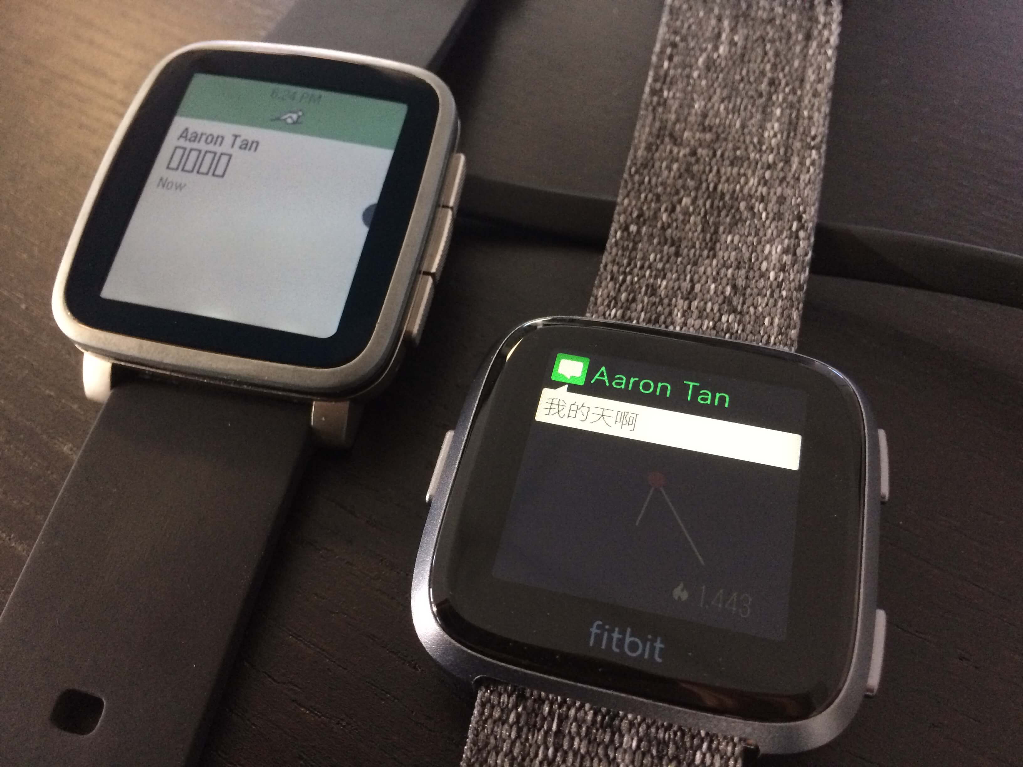
A huge benefit of the Fitbit Versa: better CJK font support! And, not shown in the picture: *actually functional emoji*.
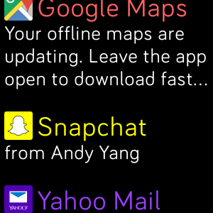
Once I got that set up though, notifications arrived on my watch consistently. On Apple devices, Fitbit relies on the Apple Notification Center Service like every other Bluetooth LE device, so the Versa will receive notifications even if the Fitbit app isn’t open as long as it still has a connection over Bluetooth LE to the phone. For my most commonly used apps, the Versa has an icon and message attached to the notification, and tapping on it expands the notification to show more details such as time received and an expanded body.
Video from Fitbit's website showing the soon-to-be-released Quick replies.
[Update: notification actions are out for Android!] For now, viewing notifications is the only thing you can do with the watch. This makes notifications limited right now, but Fitbit will be updating the experience: notification replies are coming (they will be Android-only, because Apple doesn’t provide those APIs to hook into the system actions–trust me, if Fitbit could build them for iPhones, they really would have). These notification replies were released in May. The replies from the watch have five customizable canned replies, with a maximum of 60 characters each, and you can include emoji. In addition, if the notification provides an action, such as the ‘like’ button on Facebook Messenger, that option will appear on the watch as well. While the iPhone will not have notification replies, they are getting a consolation prize in the form of notification status mirroring, i.e. dismissing a notication from the watch will remove it from the phone as well.
I’m happy that Fitbit is listening to its users who want a more powerful notification experience. With the notification actions and replies, the Fitbit Versa surpasses the Amazfit Bip, whose notification system and replies are non-existent, and match the Wear OS/Pebble experience.
Also a huge, huge, huge shoutout to the team working on this: I’ve seen the work that they’ve done with regards to the updated notification system, and as an intern, it’s pretty amazing.
Built-in apps
Fitbit pre-installs some apps on the watch. Here, I’ll be talking about all of them other than the fitness related ones; check out the fitness tracking section below to read more.
Alarms
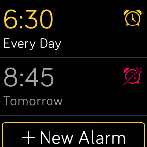
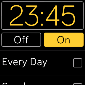
The alarms app lets you set up to eight alarms, and choose what days those alarms go off. Quick and easy to create. From the main screen, you can also tap in the corner of an alarm to quickly turn it on or off.
Because Fitbit doesn’t do tracking on the device itself, there are no smart alarms that wake you up “at the right time”. Instead, they go off at exactly when you set them. What’s more concerning is that the alarms don’t keep on going - after around five vibrations, it just shuts off. This is not good if you are a heavy sleeper, so be sure to set up a few alarms at a time to wake you up!
Music
Note: this section was edited on 2018-04-23 to replace instances of “Ionic” with “Versa”. This was a typo due to re-writes that happened but words not getting changed.😬
The “Music” app is only for local music, and is not to be confused with the music controls, which work for controlling both local music and music on your phone. There’s a separate app for Pandora and Deezer, neither of which I was able to test because I do not have a premium subscription to either of those services. Buying a watch does qualify you for a free month of Pandora, and three months of Deezer though, which is a nice kickback.
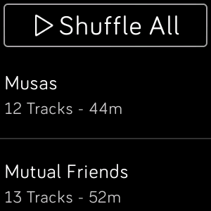
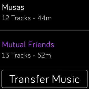
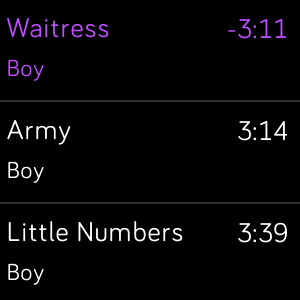
Adding local music files to the Versa involves a PC or a Mac. With the desktop app, you drag in files, organize them in playlists, and send them over Wi-Fi. Once the songs transfer (an album of 13 tracks, Mutual Friends, took about five minutes to transfer over), you’ll be able to play them over to Bluetooth devices that you’ve got paired with the watch. These files are stored locally on the watch itself, so if you’ve got some Bluetooth earbuds, you’ve basically got the 2018 version of an iPod nano! In the app, you can select which track to play, or shuffle all of your music.
All in all, I like the experience of playing music on the Versa. I just wish that transfers wouldn’t take as long.
Music controls
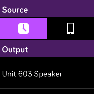
The Fitbit Versa offers music control with a popup tray accessible by holding down the back button from any part of the Versa. This control is the central hub for all music: any source from the Versa (Music, Pandora, or Deezer), as well as music playing from your phone. In this popup, you can choose which Bluetooth device to output to if you’ve got several of them paired, increase/decrease volume, play/pause, and skip forward or back in the playlist.
On Android, pairing is a little bit more annoying than iOS. You’ll have to go into settings on the watch, scroll down to Bluetooth settings, then tap on ‘Mode’ until you get into ‘Pair’ mode. This will connect your Versa over Bluetooth Classic in addition to the LE that it already uses when setting up.
Personally, I love using these controls while I’m in the shower—who doesn’t enjoy singing there once in a while?
On an iPhone 🍎 and Android 🤖, sources that worked:
- 🍎 🤖 Spotify
- 🍎 🤖 Google Play Music
- 🍎 ➖ Soundcloud
- 🍎 ❓ Apple Music (I don’t have a premium account, so I didn’t try it out on Android)
- ➖ 🤖 Shuttle
- 🍎 🤖 Pocket Casts
- 🍎 ➖ Overcast
- 🍎 ➖ Downcast
- 🍎 🤖 atp.fm/live
Apps that did not work:
- 🍎 Infuse Pro 4
Settings
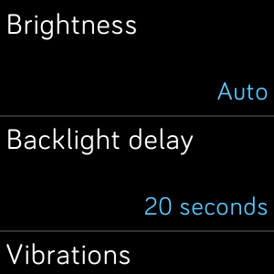
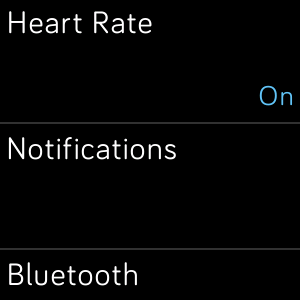
There are settings here. You can find options for display timeout time, brightness of the screen, heart rate, whether notifications come in when you’re sleeping, and paired Bluetooth devices. If you’re interested in developing for the Versa, here is also where you find the option to connect over the Developer Bridge to Fitbit Studio.
Timer
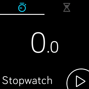
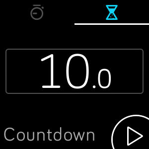
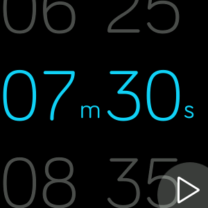
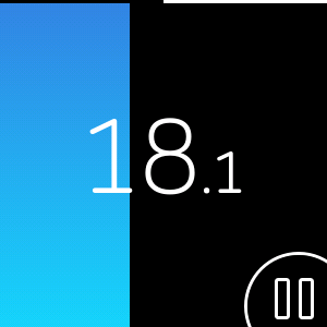
The timer app has two modes: a stopwatch, and a countdown. You can have both running at the same time, but you can’t have more than one stopwatch or more than one countdown. When a countdown has run down, you get a popup and vibrations on your wrist to notify you.
I find this really convenient for cooking, when I have things getting wet all over the place so my phone’s out of the question for fear of death.
Wallet
Again, I haven’t been able to test this because the only bank supported in Canada is RBC, but there is a list of supported banks on Fitbit’s website. Why doesn’t this use Google Pay or Apple Pay or Samsung Pay? Simple answer: because these other companies don’t license out their payment systems. That’s why Garmin uses FitPay on their watches, and Fitbit has Fitbit Pay. Even though it’s not one of the mobile giants, Fitbit’s already better than Garmin at supporting banks in Canada (1 vs 0).
This feature is also only available on the Special Edition Versas, because the standard edition does not have the NFC chip. :(
Weather
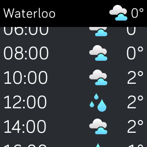
The weather app on the Versa uses Accuweather as its source. By default, it uses your location, and you can add more cities to it from the settings in the Fitbit mobile app. The app is somewhat flaky; it didn’t work for the first month I had the device and then suddenly started working on April Fools. Go figure.
The information presented is quite detailed: you get current conditions, min/max temp. for the day, chance of precipiation, and sunrise/sunset times depending on time of day. There’s also a weekly forecast, which is very helpful for planning.
Watchfaces and third-party apps
I’m actually working on the team that makes the third-party developer SDK! (SDK stands for software development kit; it’s what lets people make apps for the watch.) Most of the people around me are former Pebblers, and I’ve also met a lot of the Vector Watch employees. A lot of the lessons learned by Pebble are being applied to the developer experience at Fitbit - there’s an unofficial Fitbit Discord, we’re using JavaScript thanks to the JerryScript Project like the project at Pebble, and the general architecture is similar to that of Pebble apps - app on watch, with a companion on phone.
There’s an interview with my manager that you can read too, if you want to find out more about how it all fits together. There’s also more news about Fitbit and Jerryscript.
If you’re interested in developing a clock face or an app, take a peek at the Fitbit Developer website. We just launched a simulator, so you don’t even need to have physical hardware to get started. And if you’ve got questions, go to the unofficial Fitbit Discord - even if it’s unofficial, there some of us hang around there and you get a more direct line to the employees. :) For feature suggestions, or general complaints, check out the Fitbit Community Forums; we do check that quite a lot to see what developers want us to implement. Definitely go in there and make your voice heard by voting and commenting if you feel strongly about particular issues.
We’re working on a lot of new and interesting stuff (if you’re a developer for Fitbit OS, you’ll probably eventually interact with some code that I wrote (isn’t that a scary thought? lol)), but I’m not commenting on any unreleased plans, so don’t ask! Fitbit probably wouldn’t be happy with an intern spilling the beans.
Watchfaces
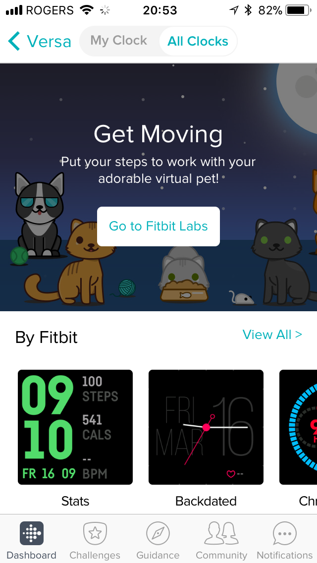
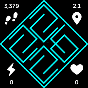
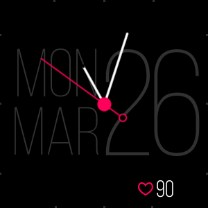
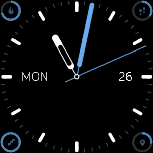
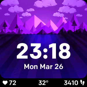
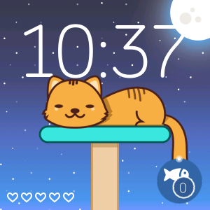
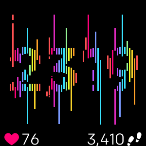
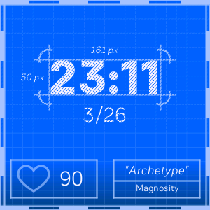
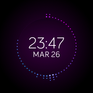
Fitbit’s App Gallery (don’t call it an app store because Apple’s boogeymen will come get you!) has a selection of 400+ watchfaces currently available, although not all of these are available for the Versa. I have a few favourites, and there are a few Pebble mainstays that have made the leap over to the Versa.
A big caveat to watchfaces: you can only store one on the watch at a time, and manage them over the phone. This makes it difficult to switch between faces, since it takes around half a minute every time to download one again. I really wish that there could be a shortcut list or keep them downloaded on the 2.5GB of storage on the watch!
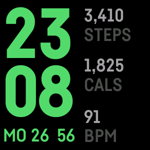
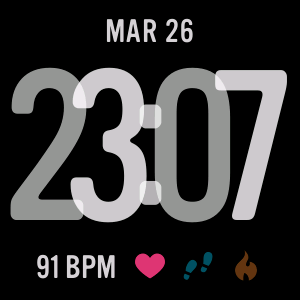
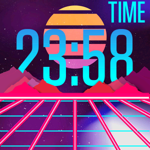
Picasso, Backdated, TH3, Weather Land
My Cat Inca, Glitch, Archetype, Flare
Stats, Layers, Carta, Retro Sunset
Third-party apps
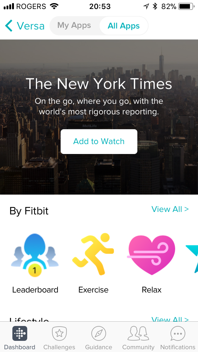
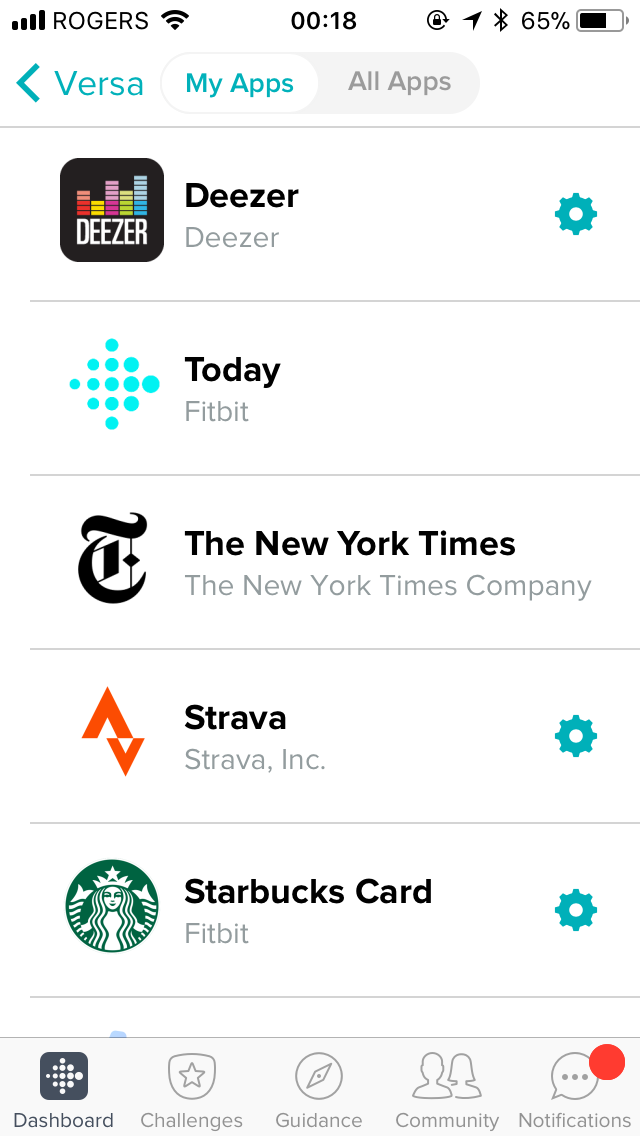
There are a few (read: 100+) third party apps that are useful, and Fitbit promises more to come with partner companies.
Neat apps available on the Versa include:
- Tennis tracking app (it’s very detailed).
- New York Times, for those breaking headlines.
- Flipboard (although it seems to only display health headlines for some reason)
- Yelp, for restaurant and POI reviews.
- Tomatina (disclaimer: I made this one), a Pomodoro timer.
- Maps, slow but somewhat useful.
- 2048, just because it’s cool to play on your wrist.
- Think Fast, a fun little game by Fitbit Labs where it tests your reaction times.
- GAgenda, a calendar that syncs with your Google account.
- Clue, if you want an alternative to the (yet to be released) female health tracking on the device.
- Surfline, for those waves!
Fitness
Coach
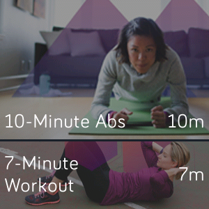
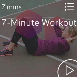
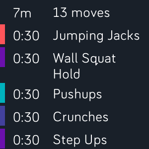
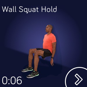
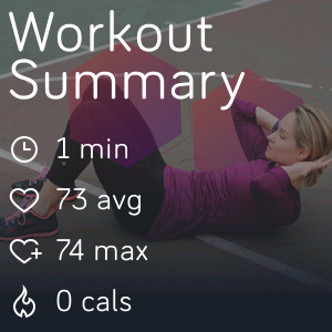
Fitbit provides three exercises on the watch itself, and they’re planning on adding more. With these exercises (named 10-Minute Abs, 7-Minute Workout, and Treasure Chest), you get little pictures of people doing the exercise to guide you along. These exercises are pretty intense! Fitbit also has dynamic workouts available on the watch, with one dynamic workout available for free. Access to more means you’ll need a Fitbit Coach subscription.
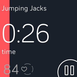
When you start an exercise, there’s a little animated image of somebody demonstating the image, and then a timer that tells you how long you should be doing that exercise. Once it concludes, you get a little summary.
Exercise
It’s one of the most important apps on the device, and Fitbit’s buttons shine here.
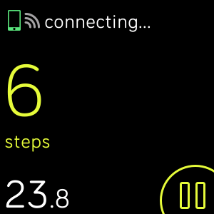
The exercise app is an app that most people who are Fitbit customers will use, so it’s one of the most important apps on the device. Unsurprisingly, it’s pretty well thought out! On launch, the app allows you to select a type of activity to start (by default, there are five, but buried in the mobile app are options to swap them around and stuff.) For most types of exercise, you get options to show laps, customize stats, toggle GPS and always-on screen, and customize what stats are displayed while exercising. It’s extremely easy to see quick stats like heart rate, distance elapsed, and all that fun stuff with just a on the screen or a click of a button.
What can the Fitbit track?
- Walk
- Bike
- Treadmill
- Run
- Hike
- Swim
- Weights
- Spinning
- Tennis
- Yoga
- Pilates
- Martial Arts
- Circuit Training
- Stair climbing
- Interval workout
- Golf
- Bootcamp
- Kickboxing
- A generic “Workout”
A list of displayable stats:
- Distance
- Pace
- Pace (Average)
- Heart Rate
- Calories Burned
- Steps
- Time of Day
- Lap Time
- Lap Distance
- Elapsed Time (during an activity)
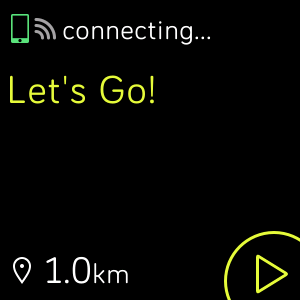
Fitbit’s buttons shine here. You can click the ‘down’ button to start, then pause an activity, the ‘up’ button to end tracking, and the ‘back’ button to toggle between different types of stats. With the Versa, since there is no GPS on the device, you’ll be relying on your phone’s GPS to trace where you are. When you start an activity, it’ll show you that it’s connecting to your phone, and once it connects, it’ll give you two quick vibrations to let you know that it’s established a lock on your device. You don’t need to wait while it finds you, which is better than the Amazfit Bip already - it’ll just start tracking your location whenever your phone is ready.
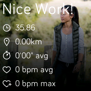
During an activity, you’ll get laps/cues at intervals that you can customize in the app. These give you quick stats about your heart rate, your pace, and more. After you’re done with an activity, you get a quick summary, and you can see more details of your activity, like a map of your route, elevation, a heart rate graph, etc. on your phone or the web dashboard.
Activities are also automatically tracked without opening the exercise app, but only if you have connected GPS enabled. Even though it requires GPS to be enabled though, it does not show a map of your activity after the fact. This is great for casual activity, like walks, especially if you forget to open the app. It’s tracked the start and end points of a long walk accurately for me.
Today
A tentpole feature of Fitbit OS 2.0, the new Today app brings together pretty much all of the Fitbit experience.
With a quick swipe up, you see:
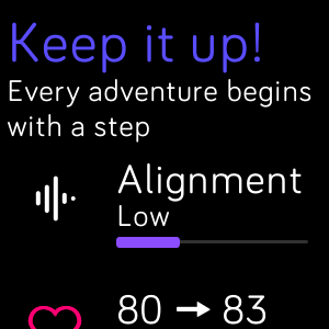
- Insights: Tips/tricks like “You can use the Relax app to take a few minutes to breathe!” and stuff like that. I disabled these. While not currently very useful, Fitbit’s website makes reference to a feature that, in the near future, will be able to learn from your activity to dynamically and intelligently suggest and remind you to do certain things. When this feature is rolled out, I might reconsider and turn this back on.
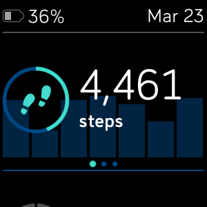
- Steps: Your steps for today, as well as a graph comparing to the previous week; with a swipe over, the distance you’ve walked, how many flights of stairs you’ve climbed, calories, and active minutes. Very convenient.
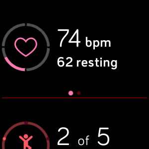
- Heart rate: Your current heart rate, your resting heart rate, which heart rate zone you’re in; with a swipe over, the a graph compared to the previous week of resting heart rate.
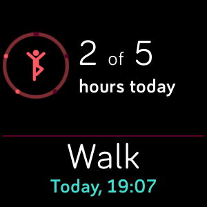
- Daily Mini-goals: How many hours you’ve hit your 250 step goal. I love these things.
- Female health tracking: if you enable this feature, you’ll be able to see how far along your cycle you are. It’s not out yet, but is coming in Spring 2018.
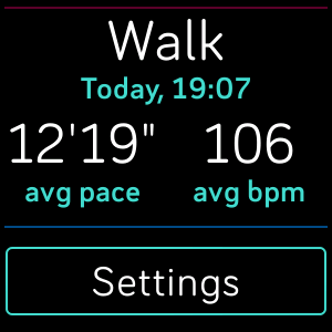
- A summary of your last three activities: When your activity took place, your average pace, and average heart rate during the activity.
I love this dashboard. I use it several times a day, and it makes checking your stats so much easier than needing to pull out a phone. I cannot overstate how much I love being able to do a quick checkup on how far along my goals I am for the day. You can also reorder the tiles by pressing and holding: I have my heart rate at the top, then my step goals, then my total step count. Plus, the heart on the dashboard actually beats in time with your actual heartbeats. It’s so cute!
Relax
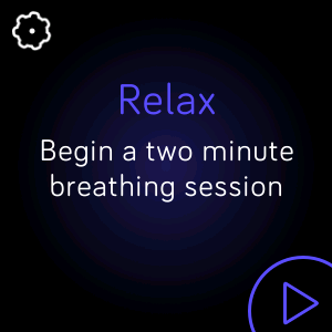
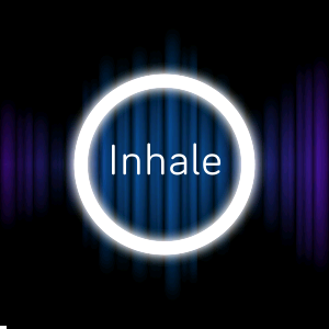
The Relax app lets you go on some guided breathing sessions. What’s cool about this is the graph of your breathing in the background. It vibrates when you need to breathe in, and vibrates when you breathe out. Reminds me of some other smartwatches… Generally pretty cool, but not really something that I use all that often.
Other fitness-tracking related things
There are a few other fitness tracking related things that the Fitbit Versa allows you to do that I want to talk about: sleep tracking, heart rate tracking, and the step reminders.
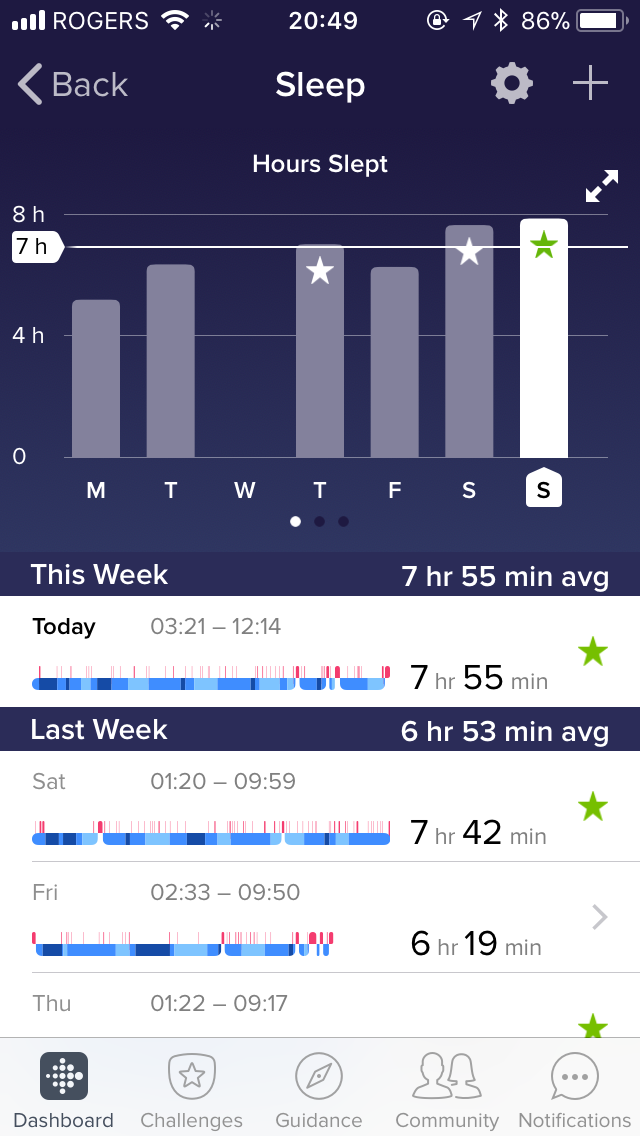
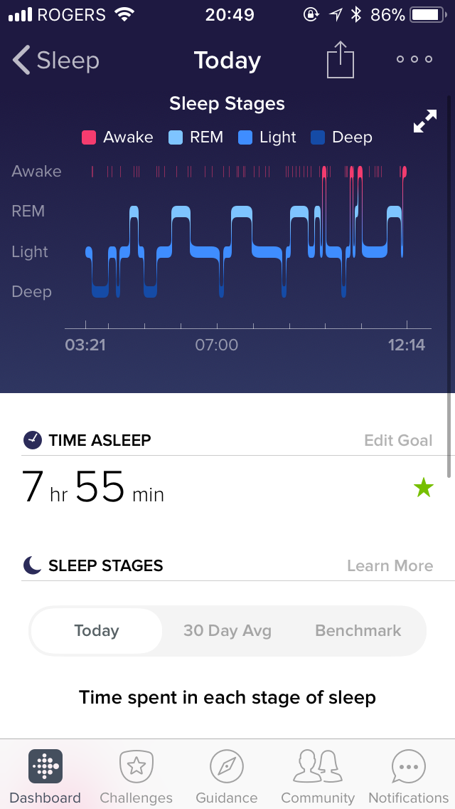
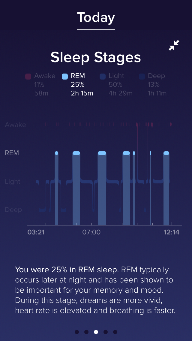
As a student, I feel like half of my life is governed by a mantra of “Sleep is for the weak” sometimes, which is why I really love the sleep-tracking feature on the Fitbit. It uses heart rate as well as the gyroscope to track how well I sleep over the course of the night. There are some very nice graphs that you can see on the website, as well as “insights” in the mobile app. What’s great about the sleep tracking is that I don’t need to tap a button or click anything to tell the watch that I’m going to sleep; it just tracks it automagically, and I love that. This is something that the long battery life of the Fitbit lets you do; I wouldn’t be comfortable doing this with an Apple Watch, for example.
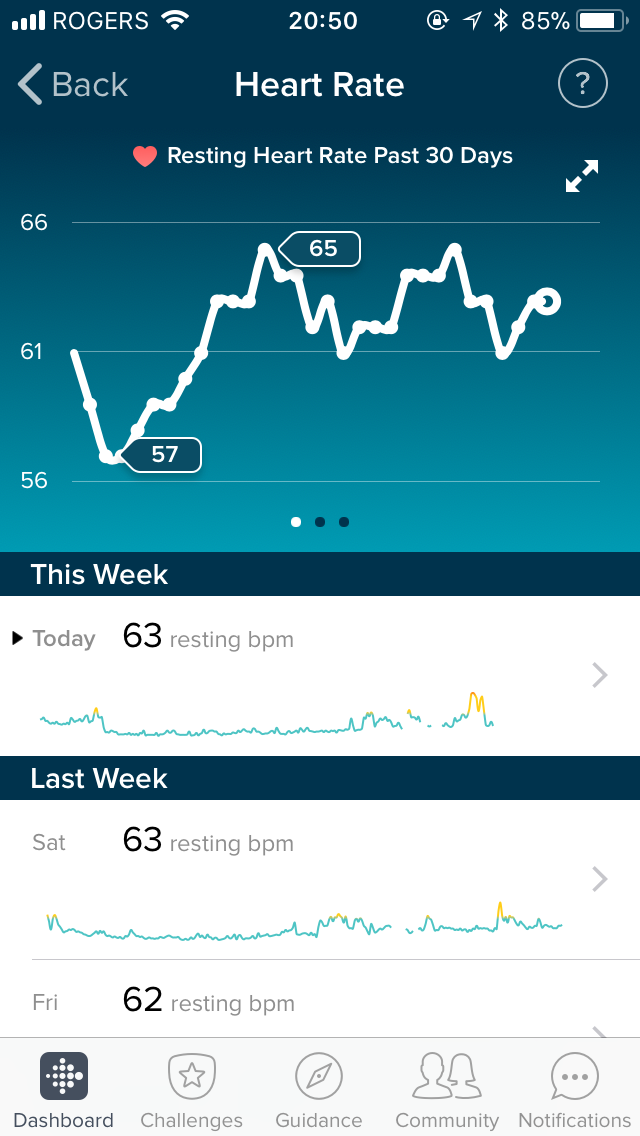
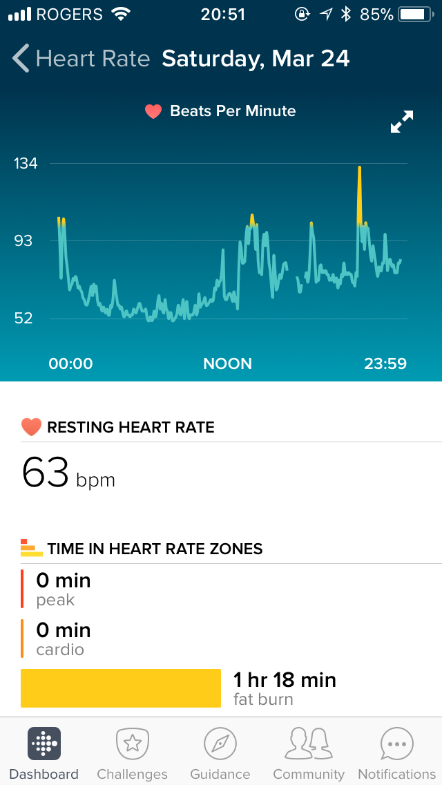
Heart rate tracking is pretty good. I can’t speak too much about the accuracy of it (because I don’t have any other device that can monitor my heart rate any more accurately), but it’s a good baseline to compare against. I like that it gives me a resting heart rate, as well as very pretty graphs to look through.
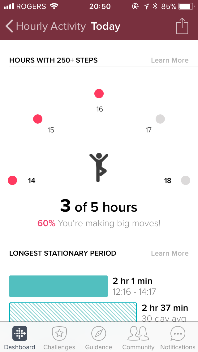
A last feature that I really like about the Fitbit are the Reminders to Move. As a programmer, I have a tendency to get super sucked into work sometimes and not want to leave my chair for hours at a time. I find that these inactivity alerts (which fire ten minutes before every hour), are great for getting me to stand up, talk a small, brisk walk, and then get back to whatever I was doing with a fresh mind. I also really appreciate the “longest time stationary” that you can find in the Fitbit app, which tells you the longest continuous amount of time that you were sitting down or lying down without moving.
Conclusion
If the Pebble Time Steel was an 8, and the Time 2 would have been a 9, I give the Versa a completely subjective and arbitrary score of 8.
I like my Fitbit Versa.
“You’re just saying that because you’re a Fitbit intern!” you might be saying. And that might be true.
But when I started at Fitbit, I was wearing my Pebble Time Steel. When I got an Ionic, I wore a Pebble Time Steel on one arm, and the Ionic on the other. It looked ridiculous (and spoiler alert: it was), but I couldn’t let go of my Pebble. Then I got my hands on a Versa in February and the Pebble Time Steel has come off my wrist.
Maybe it’s because it’s so light. Maybe it’s because the design is so much better than the Ionic. Maybe it’s because the screen turned out to be readable pretty much anywhere. In any case, I’m wearing it full-time now. And I like it.
It mostly ticks two of my three boxes that I talked about in the beginning of the review:
- Notifications? ✅ More reliable, and better CJK/emoji support,
but no actions yet[Update: Now available with Fitbit OS 2.1!]. - Music Control? ✅ Definitely there, plus local music on the watch.
- Watchfaces? ➖ Not an always-on screen, but plenty of watch faces to choose from.
If the Pebble Time Steel was an 8, and the Time 2 would have been a 9, I give the Versa a completely subjective and arbitrary score of 8. It’s a side-grade from a Pebble Time steel: more stable connection to the phone, nicer (in terms of colours) screen, better fit and finish; at the same time, fewer third-party experiences, less good notification handling, and no always-on screen. It’s like Pebble’s spiffy friend that wants you to get fit.
Fitbit has created a fitness-focused smartwatch that appeals to the sporty people, but it’s still not quite a full smartwatch solution yet. It’s getting there. The Fitbit Versa is already much better than the Fitbit Ionic, and Fitbit is doing their best to expand out of the cratering tracker market. And unlike Google, who’s been neglecting Wear OS, or Apple, who is still basically the iPhone company, Fitbit’s entire future rests on the success of these, and any future smartwatches.
They have to continue improving to succeed. And they’re doing a pretty damn fine job already.
aaron at 21:11

